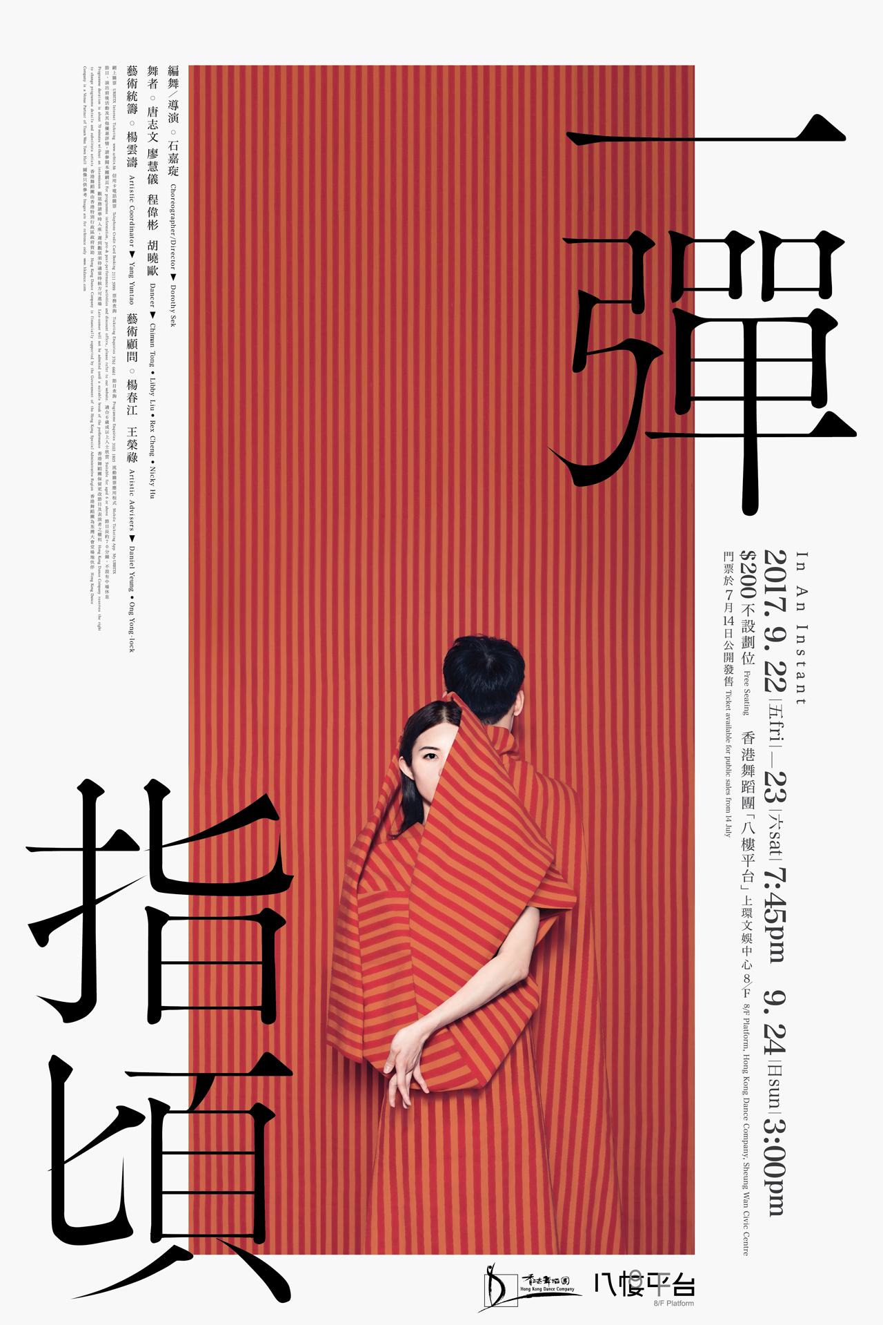
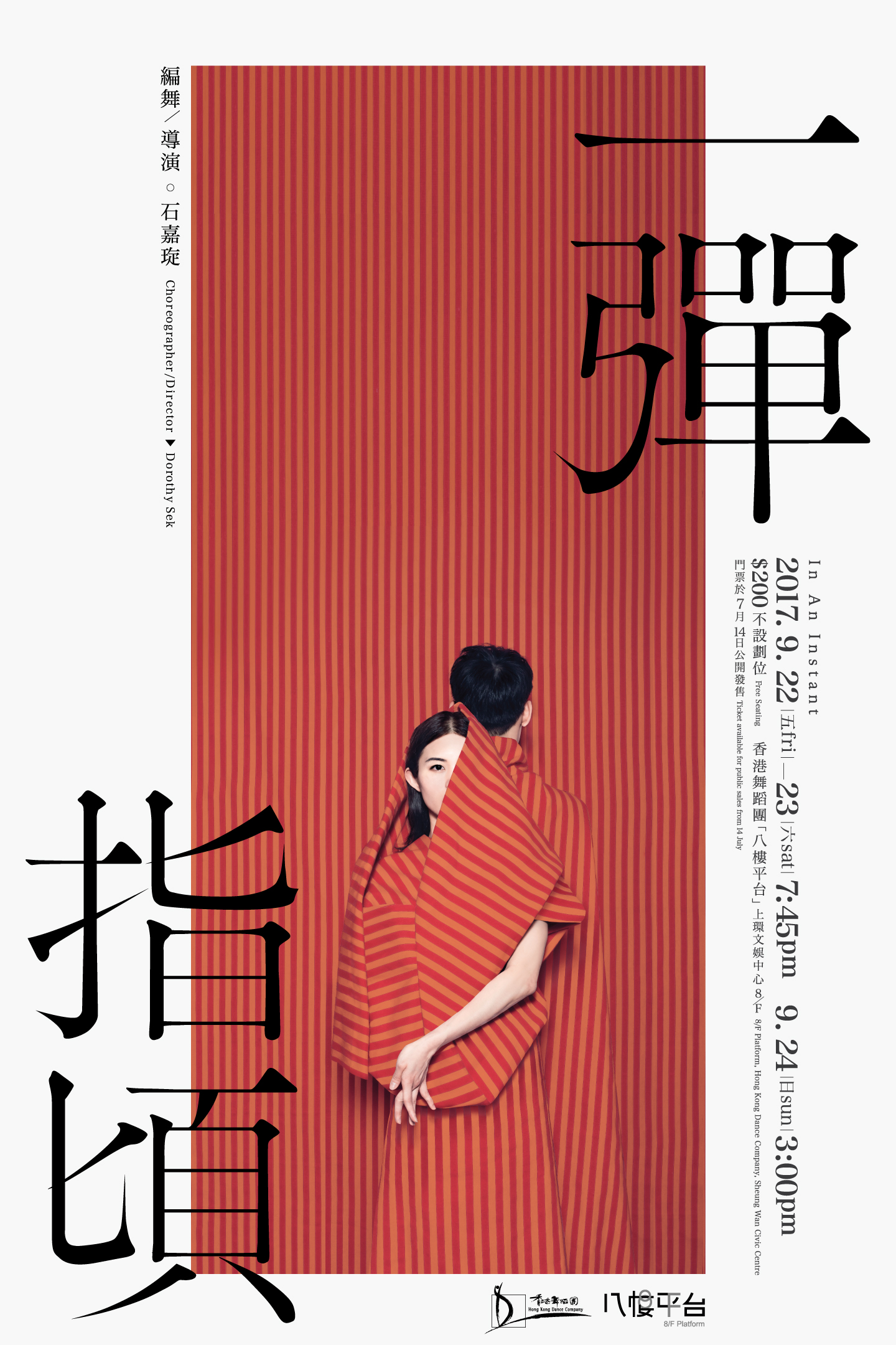
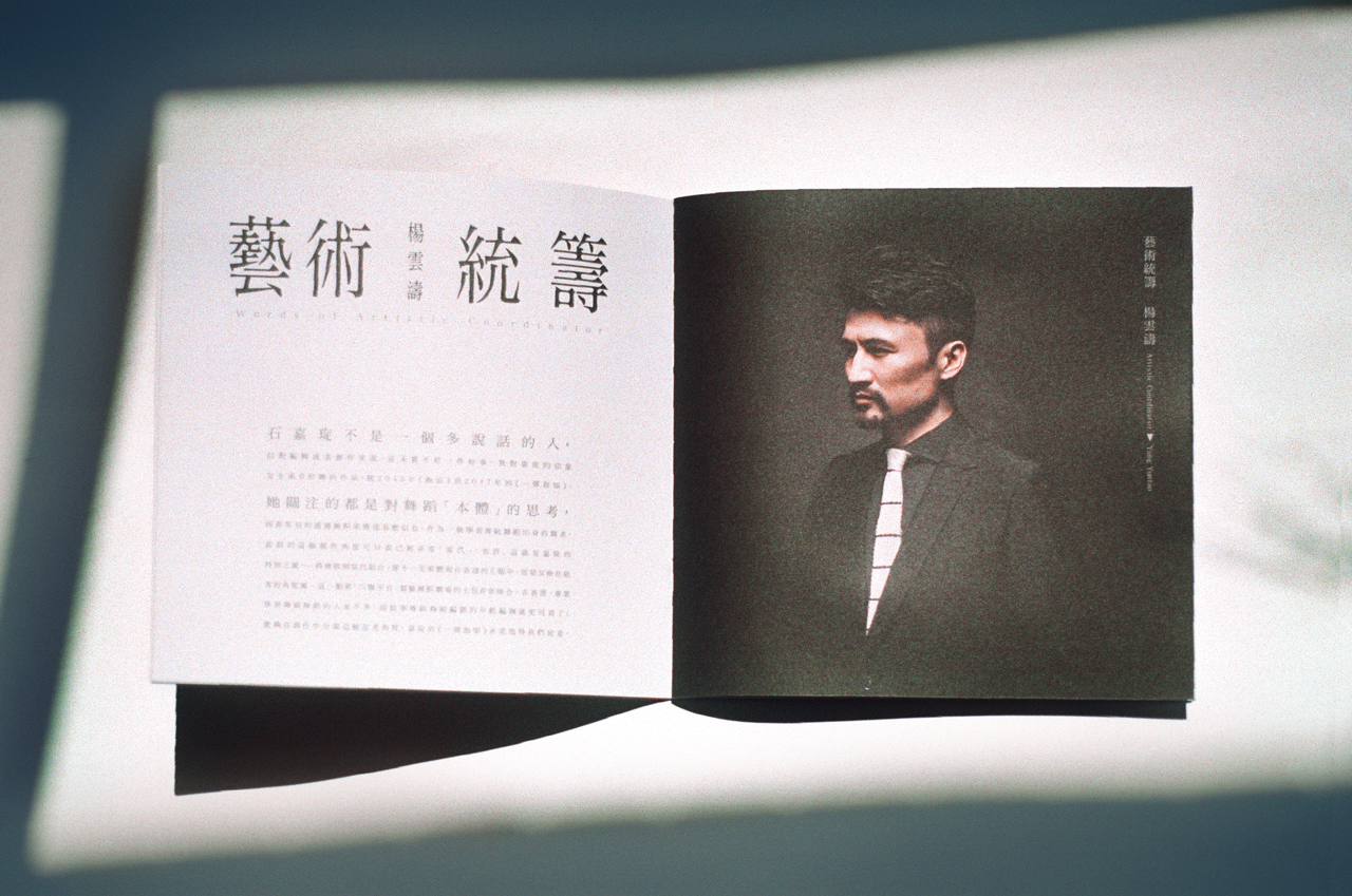
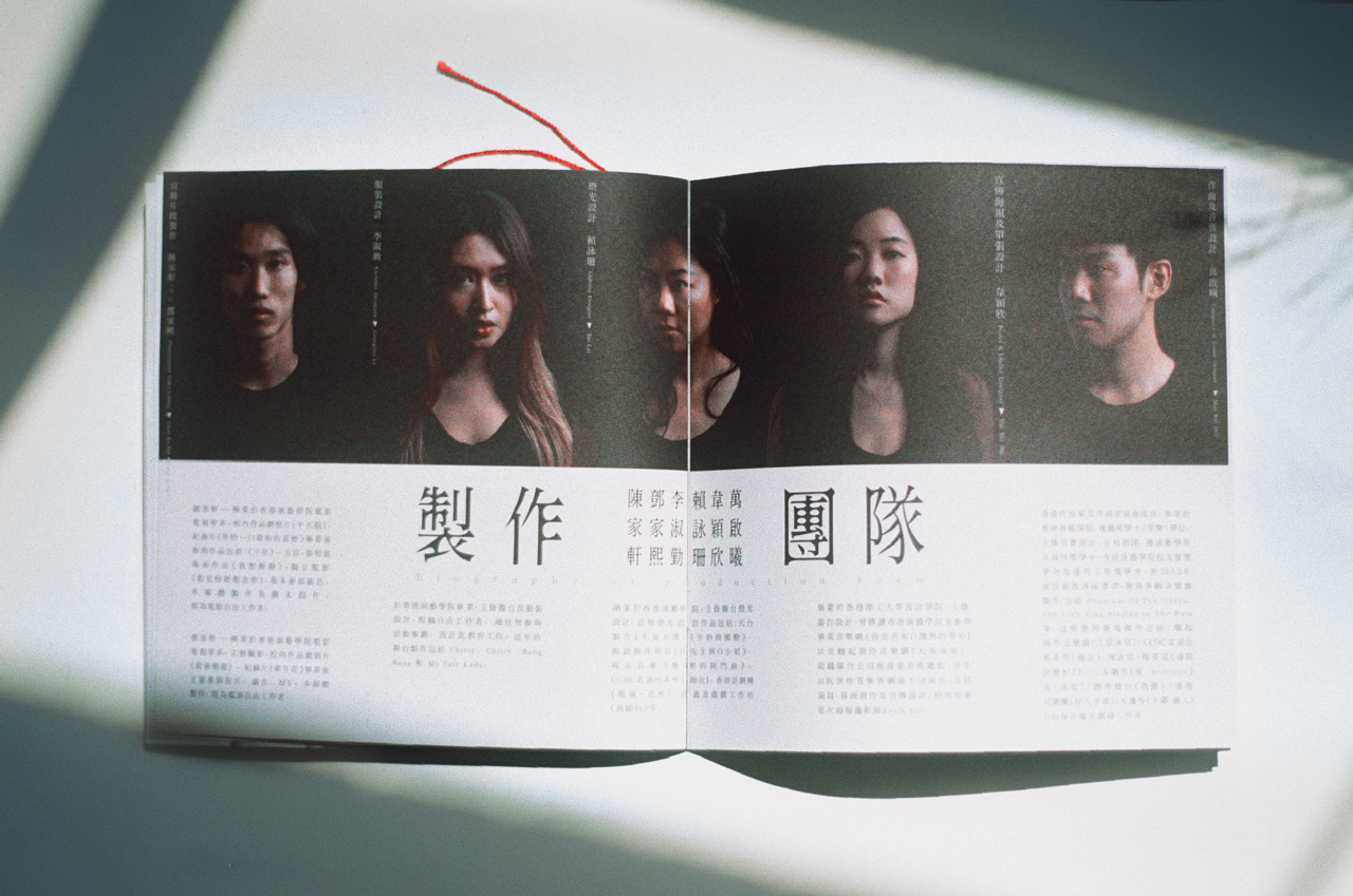
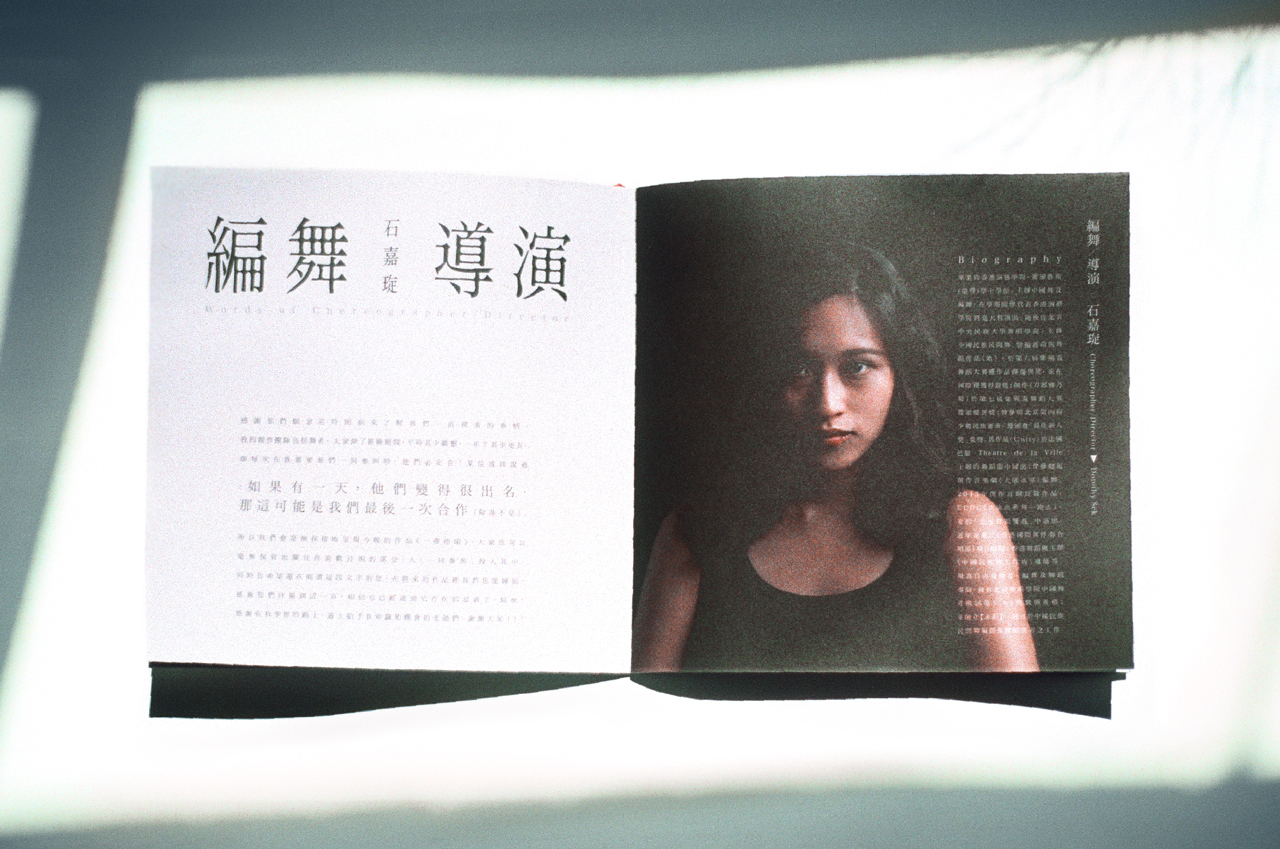
一 彈 指 頃 I n A n I n s t a n t | Dance Performance Show Image
Performance Director : Dorothy Sek
Art Direction : Wai Wai Wai
Photographer : Keith Sin
Retouch : Wai Wai Wai
Graphic Layout : Wai Wai Wai
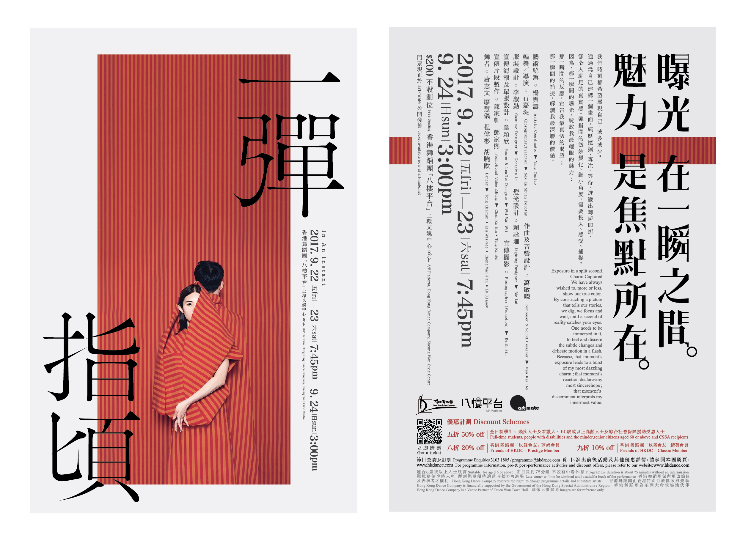

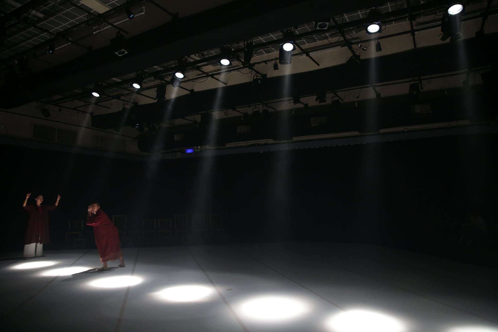
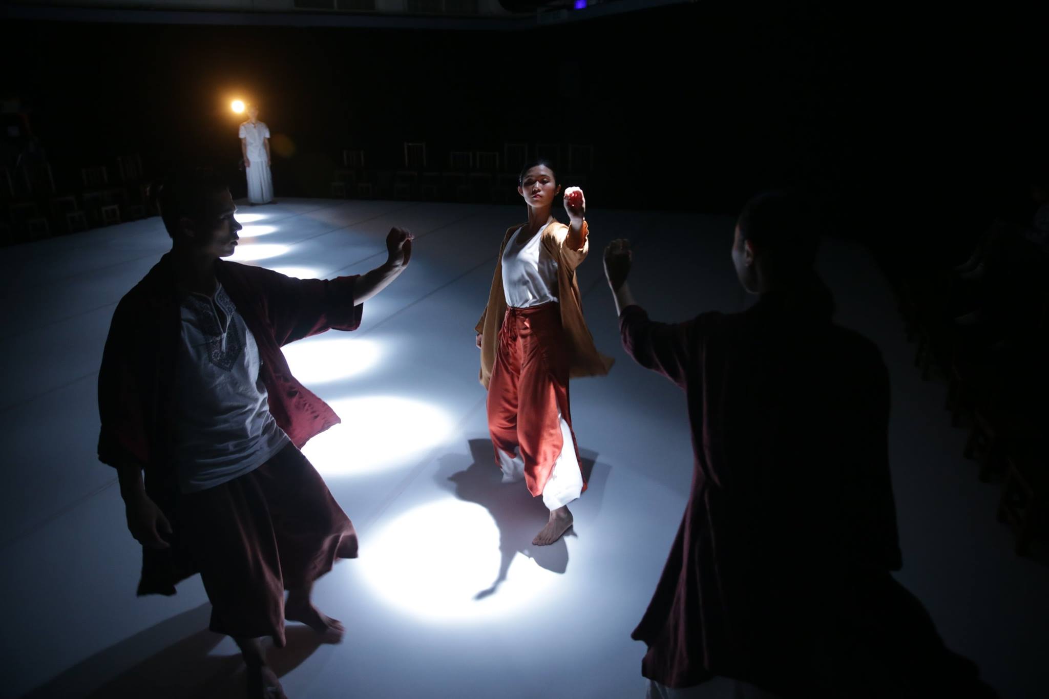
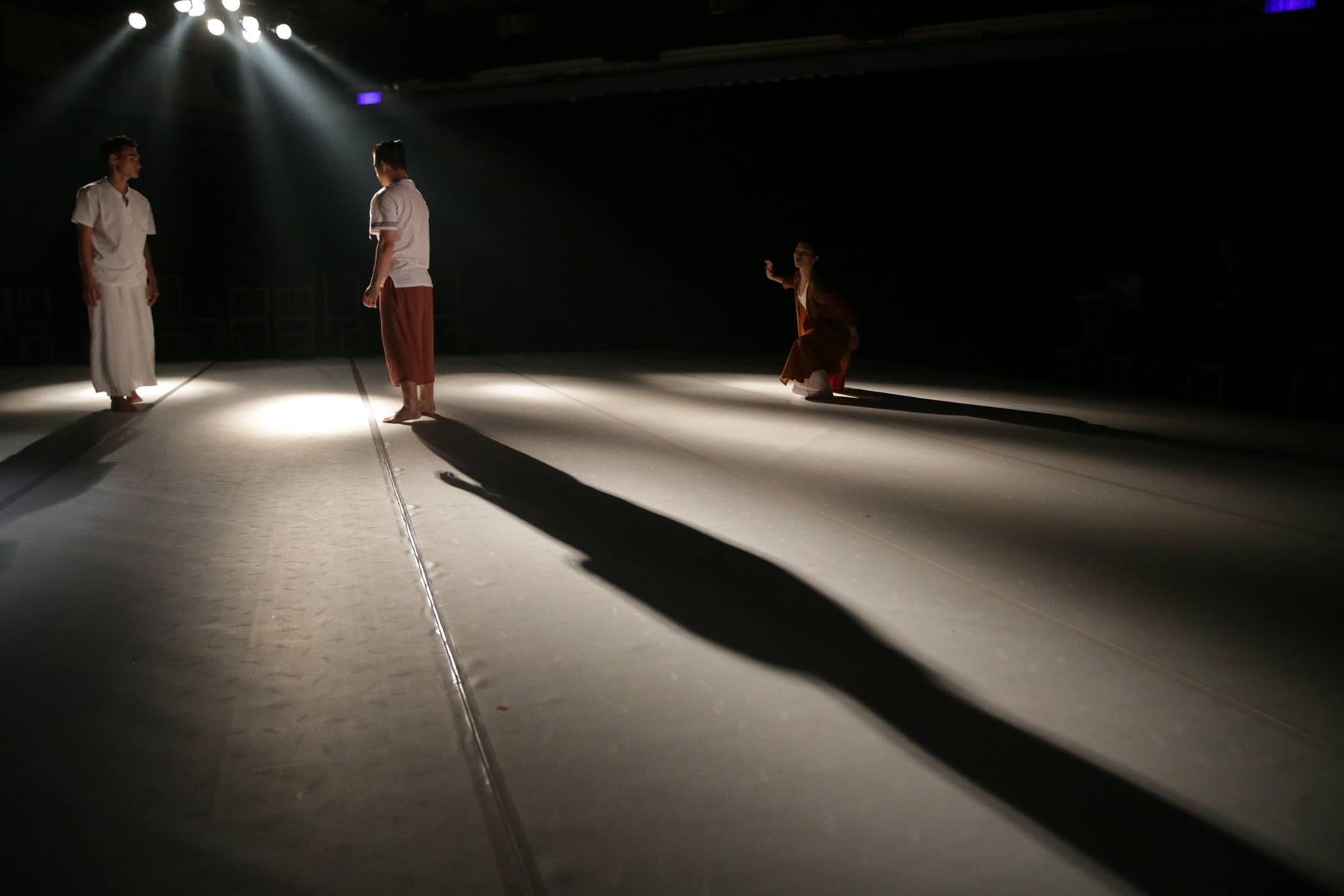
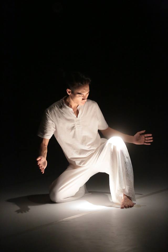
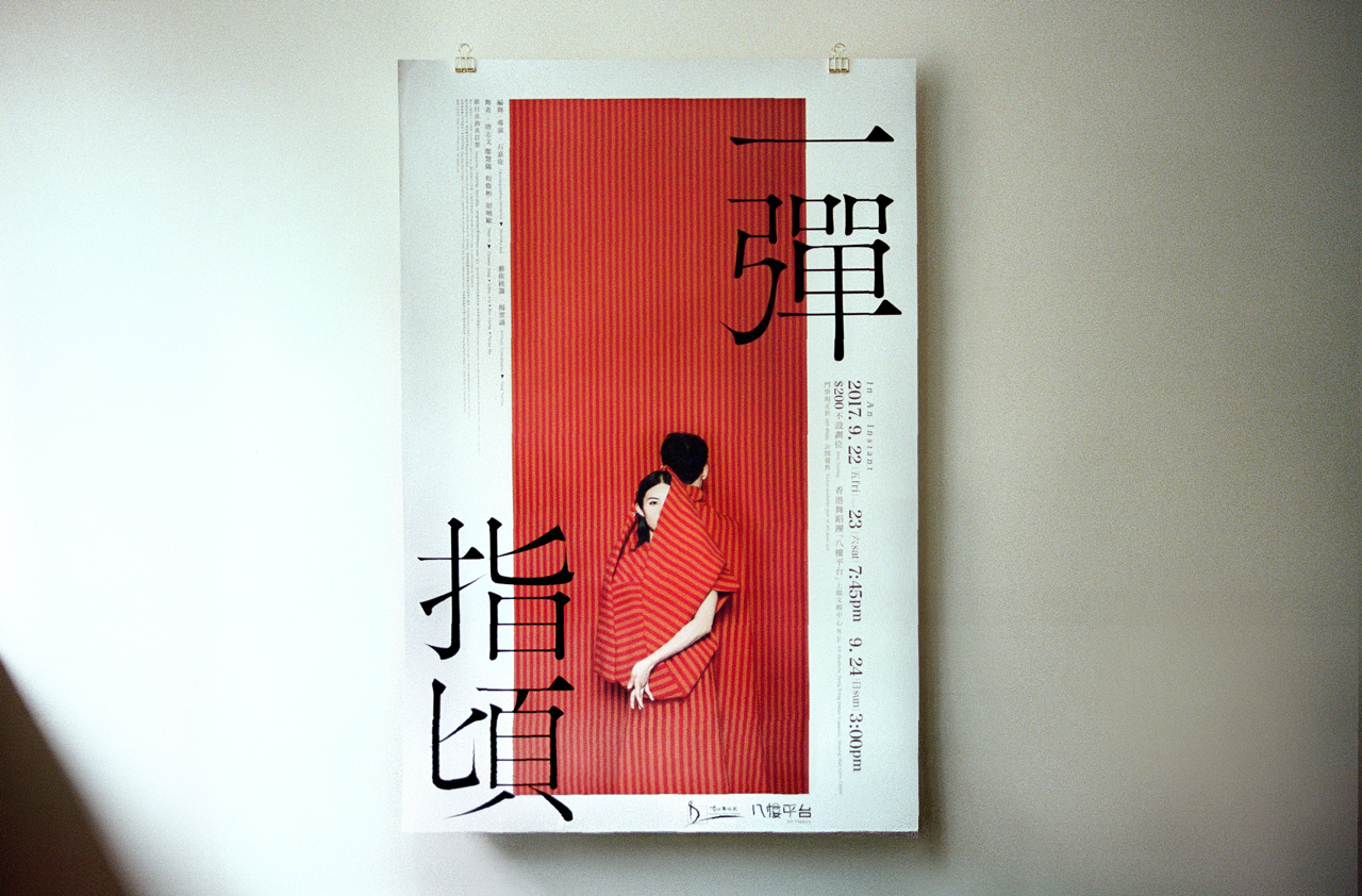
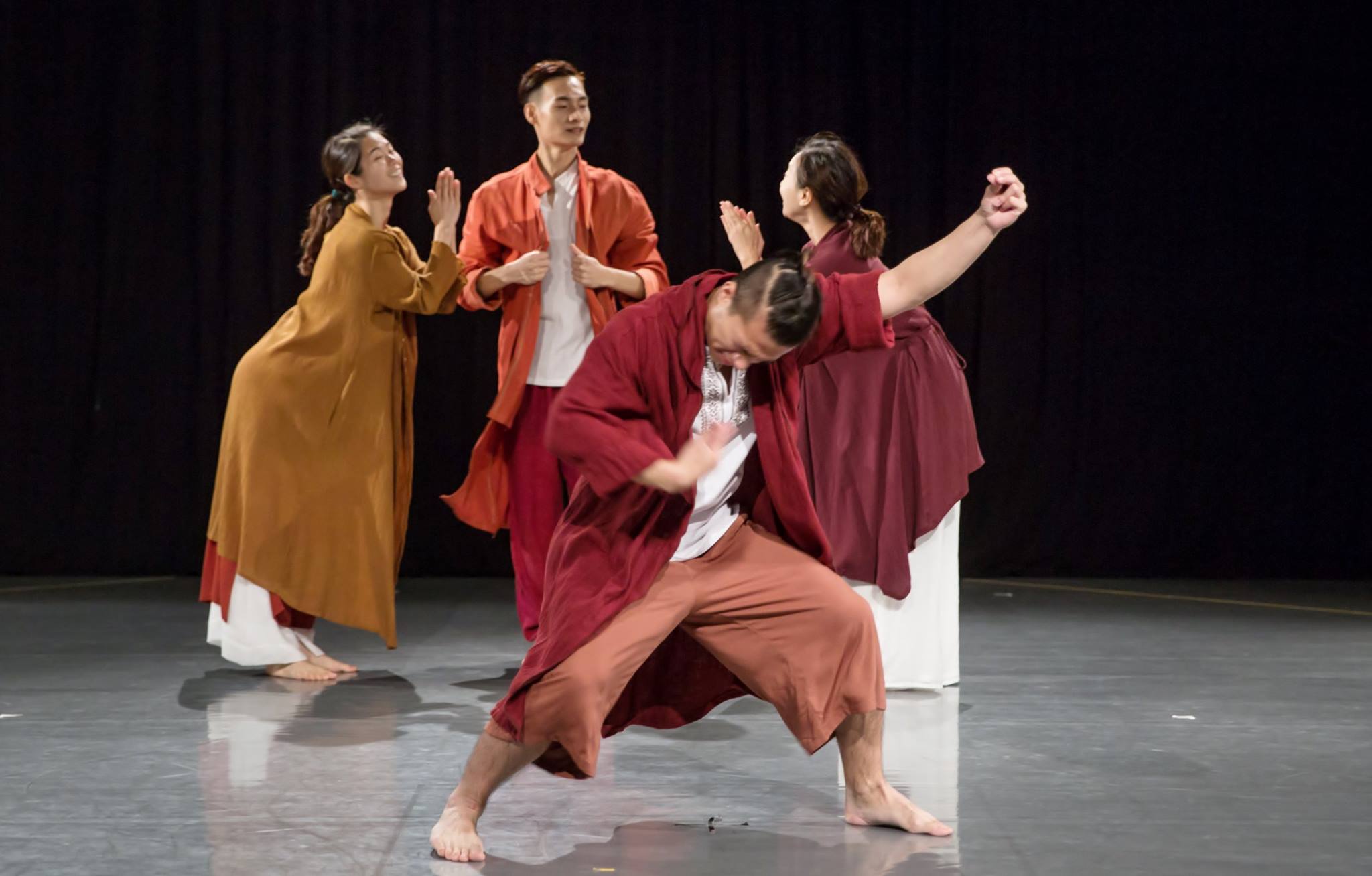
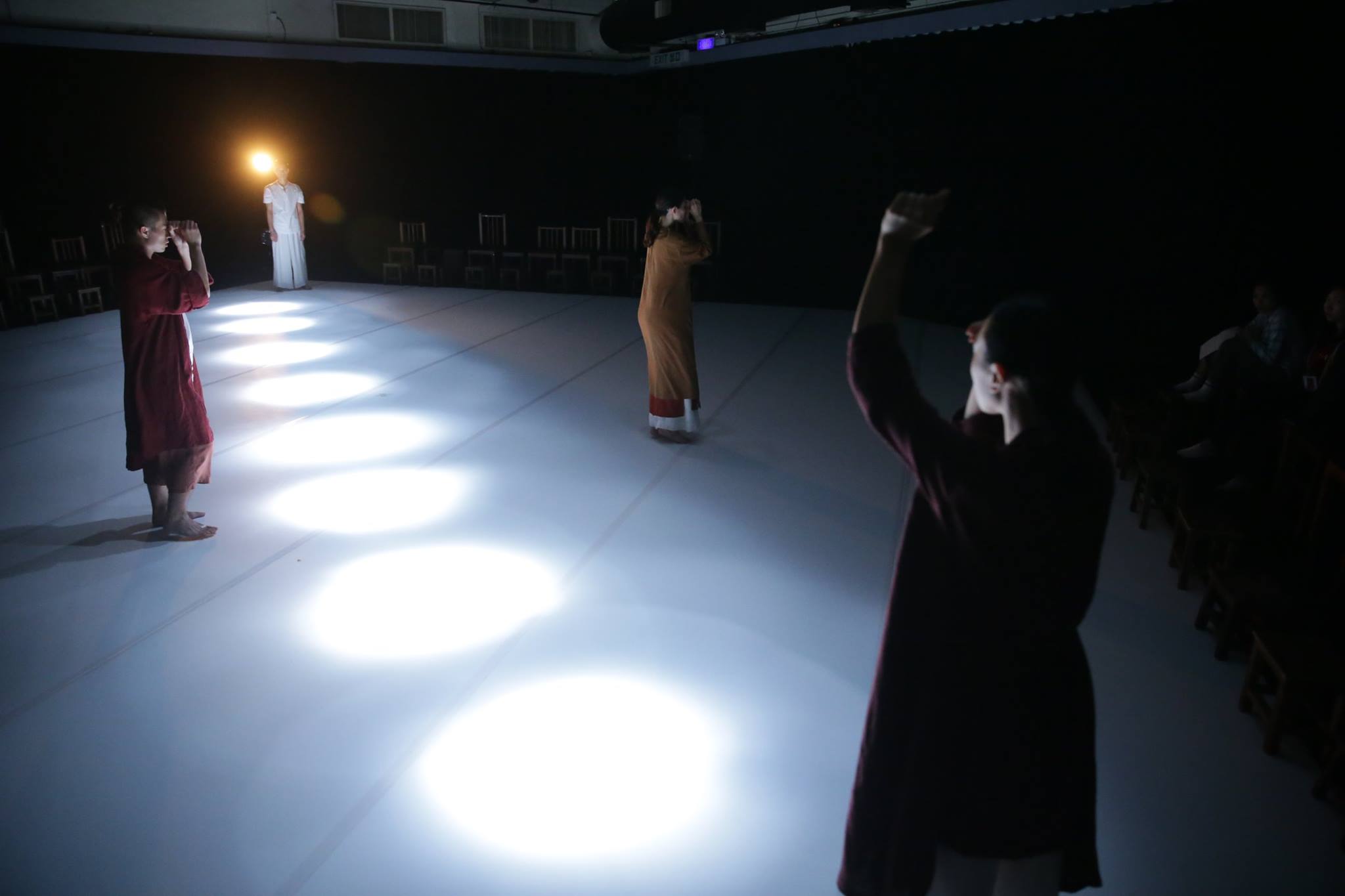
一彈指頃 In an instant
.
.
曝光,在一瞬之間
魅力,是焦點所在
我們時刻都希望展現自己,或多或少。通過爲自己建構一個畫面,經歷挖掘、專注、等待,迸發
出轉瞬即逝,卻令人駐足的真實感。
彈指間的微妙變化、細小角度,需要投入、感受、捕捉
因為
那一瞬間的曝光,綻放我最耀眼的魅力
那一瞬間的反應,宣告我最真切的渴望
那一瞬間的捕捉,解讀我最深層的價值
Exposure in a split second
Charm captured
We have always wished to, more or less, show our true color. By constructing a picture that tells our
stories, we dig, we focus and wait, until a second of reality catches your eyes.
One needs to be immersed in it, to feel and discern the subtle changes and delicate motion in a flash.
Because
That moment’s exposure leads to a burst of my most dazzling charm
That moment’s reaction declares my most sincere hope
That moment’s discernment interprets my innermost value
.
.
27. 7 . 2017 ‧ M i l k M a g a z i n e ‧ F e a t u r e i n t e r v i e w
// IN AN INSTANT 【 香港設計 ‧ 七月之選】
text_emily | design_kin
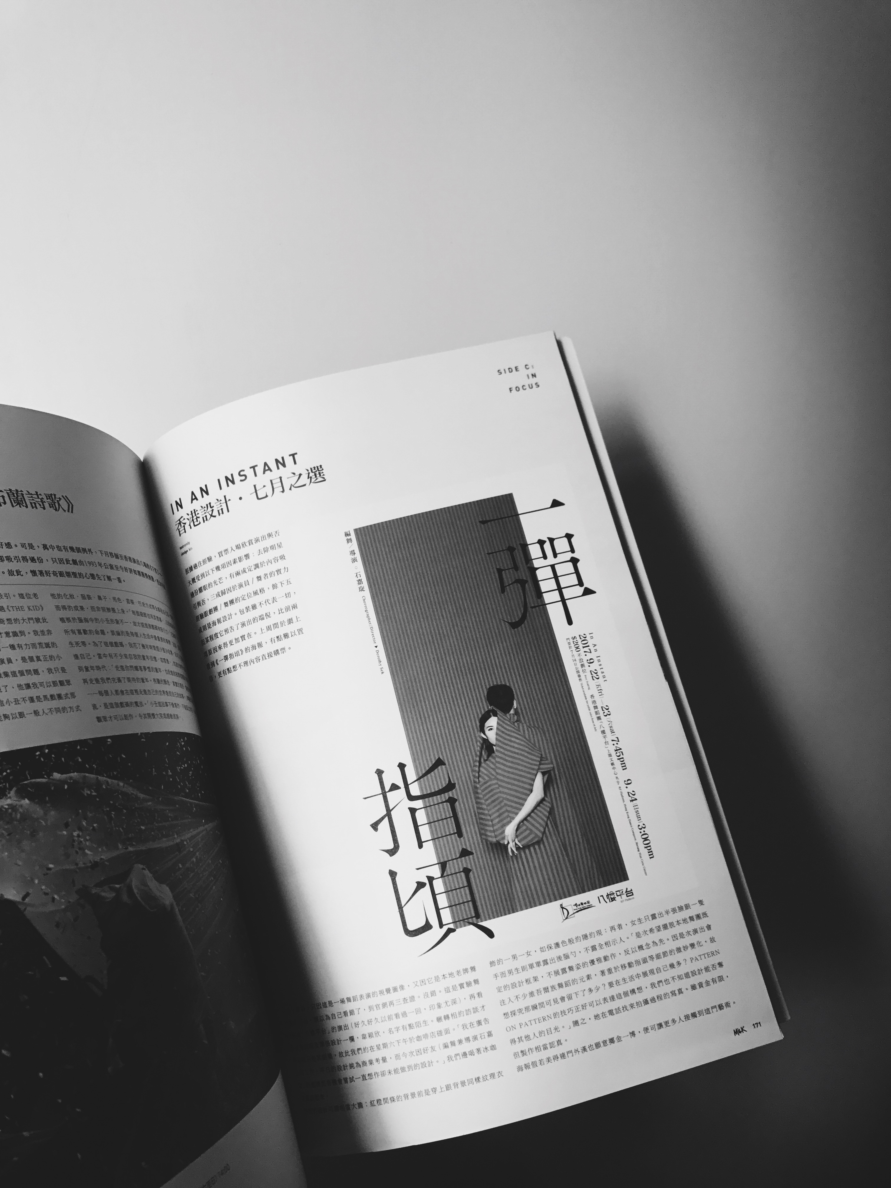
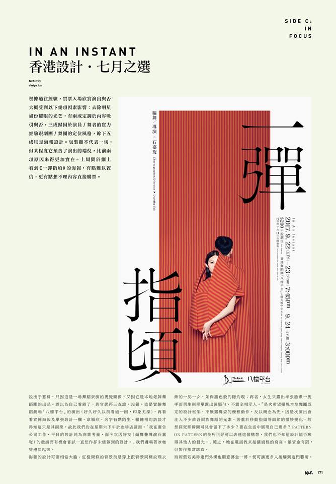
根據過往經驗,買票入場欣賞演出與否大概受到以下幾項因素影響:去除明星過份耀眼的光芒,有兩成定調於內容吸引與否,三成歸因於演員/舞者的實力經驗跟劇團/舞團的定位風格,餘下五成則是海報設計。包裝雖不代表一切,但某程度它預告了演出的端倪,比前兩項原因來得更加實在。上周間於網上看到《一彈指頃》的海報,有點難以置信,更有點想不理內容直接購票。
說出乎意料,只因這是一場舞蹈表演的視覺圖像,又因它是本地老牌舞蹈團的出品。誤以為自己看錯了,到官網再三查證。沒錯。這是實驗舞蹈劇場「八樓平台」的演出(好久好久以前看過一回,印象尤深),再看看宣傳海報及單張設計一欄,韋穎欣,名字有點陌生。輾轉相約訪談才得知這只是其副業,故此我們約在星期六下午於咖啡店踫面。「我在廣告公司工作,平日的設計純為商業考量,而今次因好友(編舞兼導演石嘉琁)的邀請而有機會嘗試一直想作卻未能做到的設計。」我們邊喝著冰咖啡邊談起來。
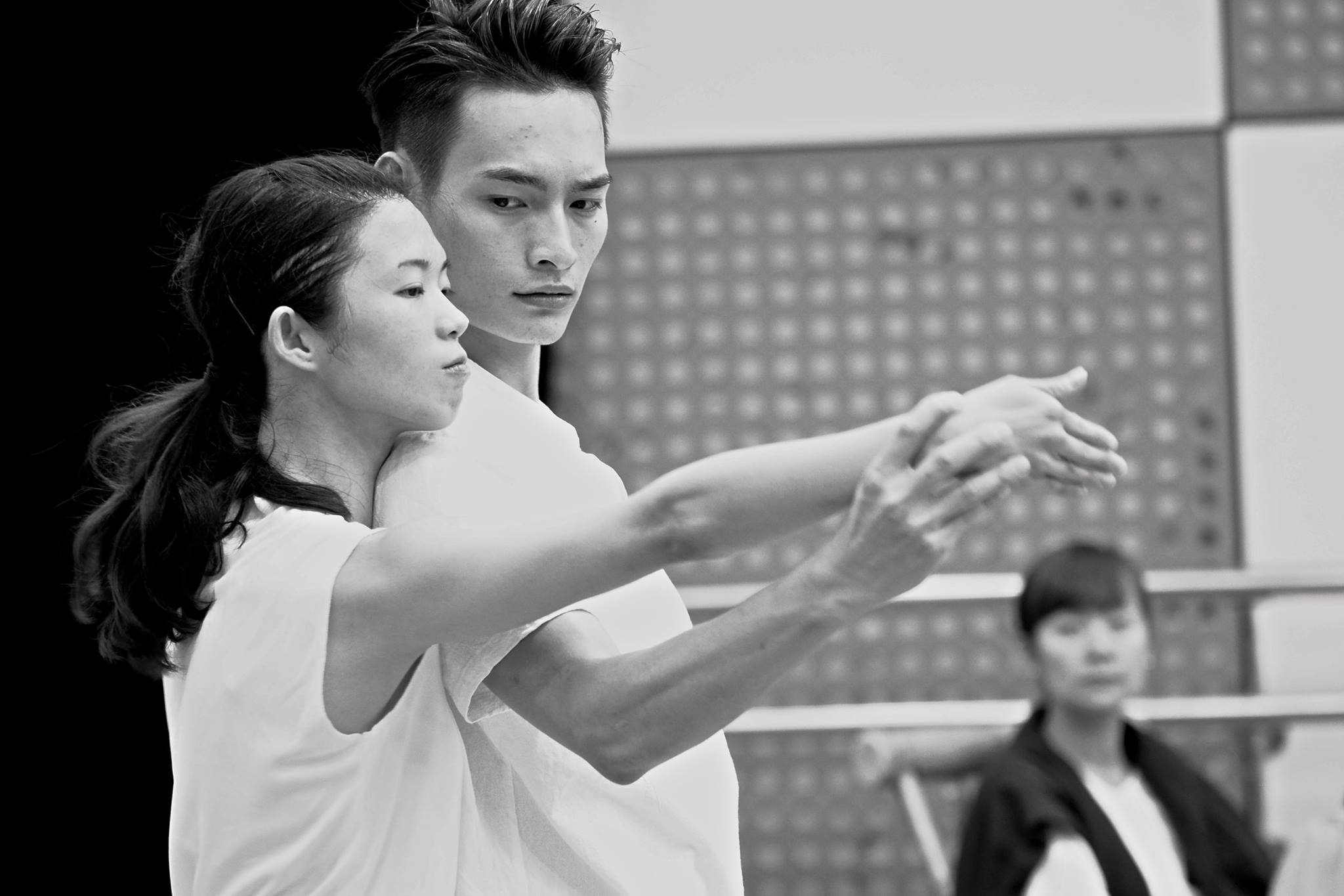
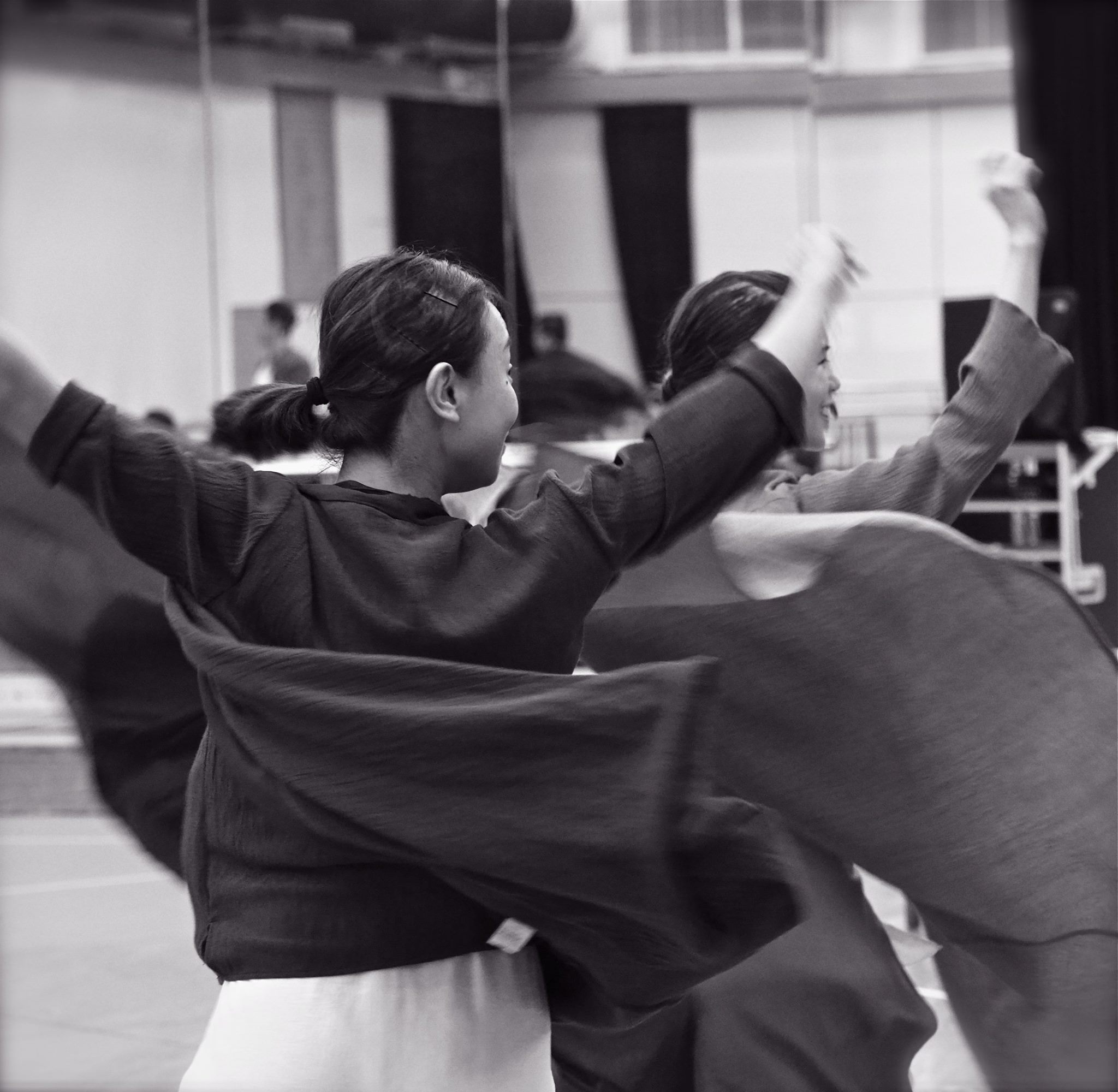
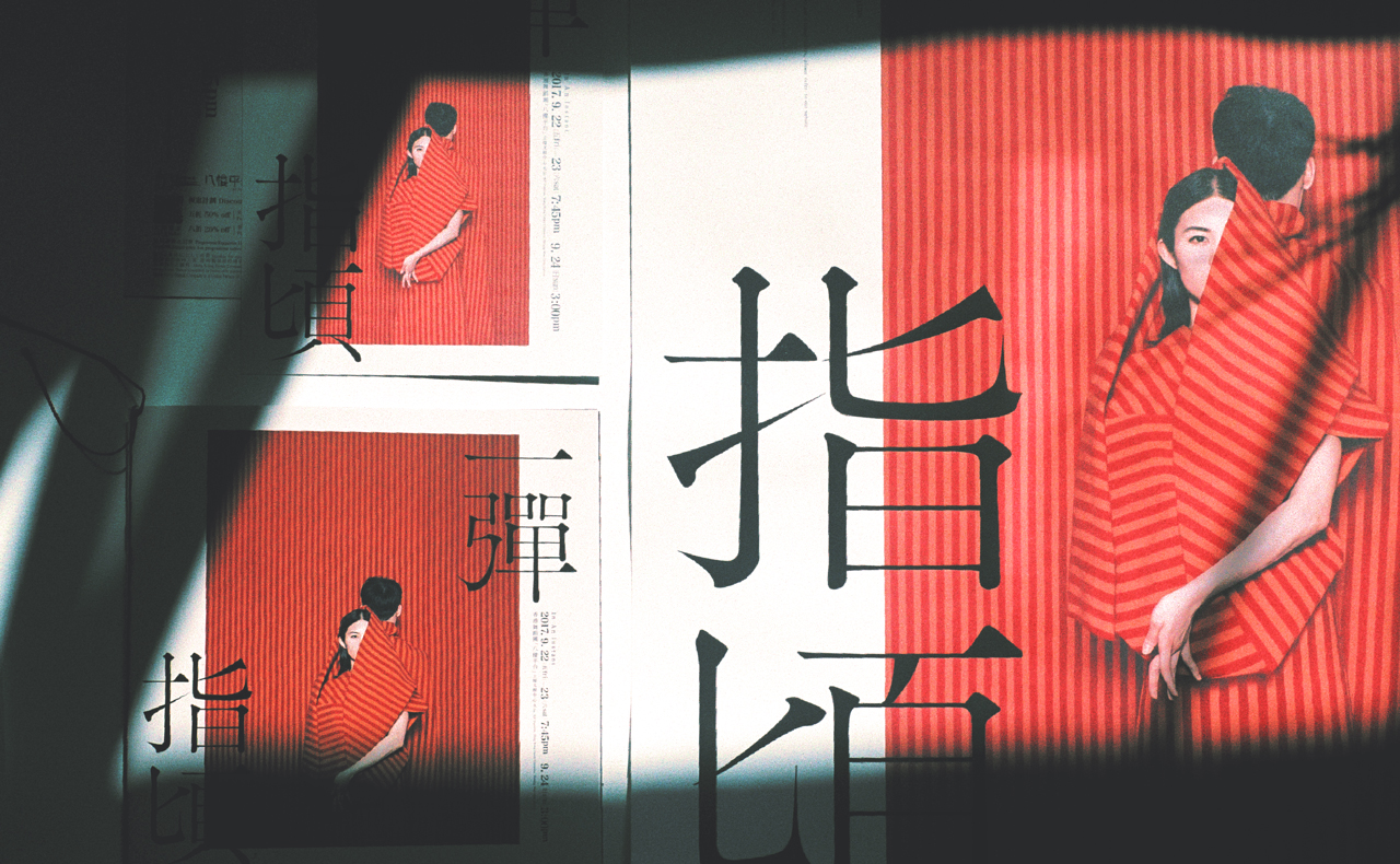
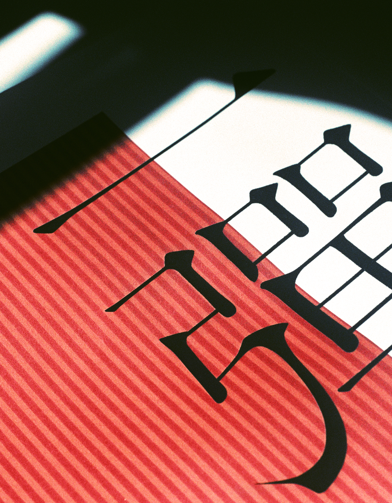
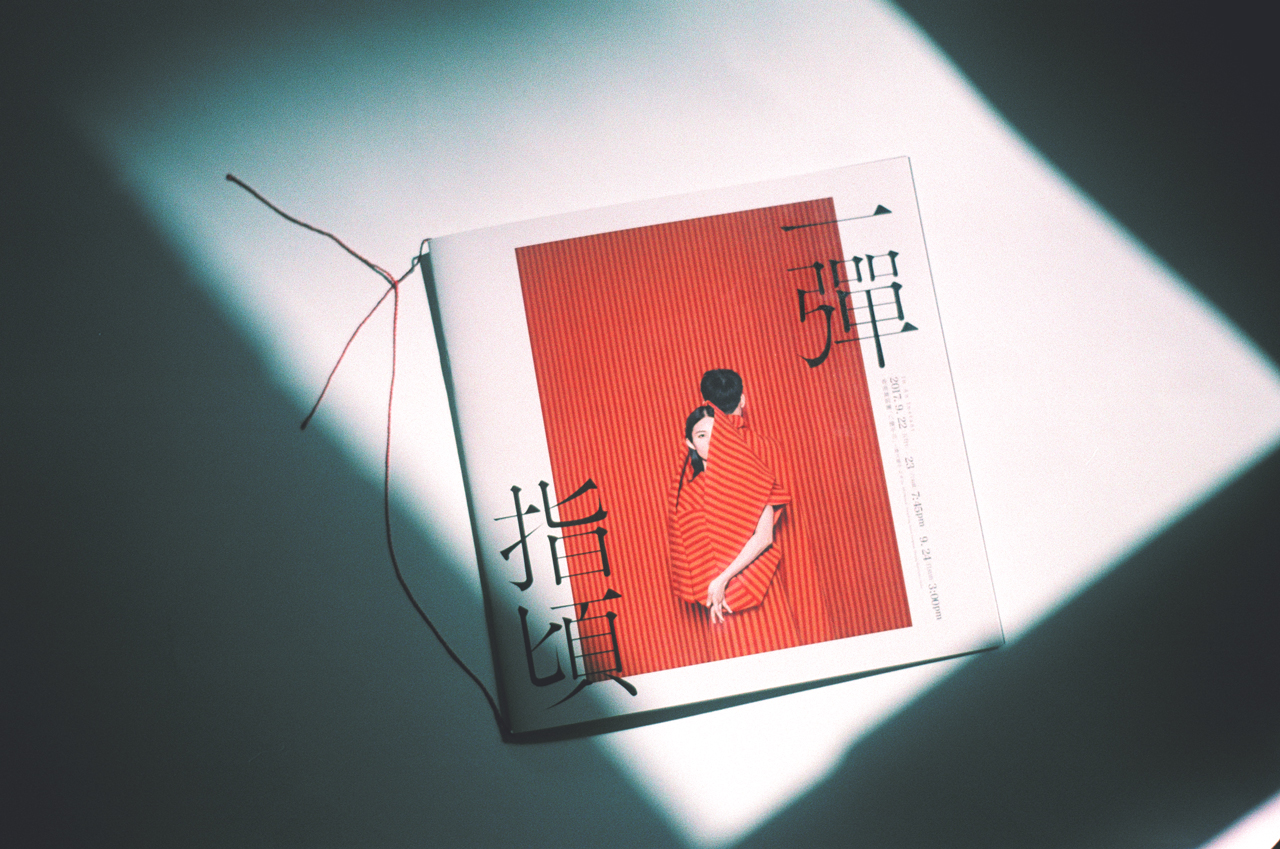
海報的設計可謂相當大膽:紅橙間條的背景前是穿上跟背景同樣紋理衣飾的一男一女,如保護色般約隱約現;再者,女生只露出半張臉跟一隻手而男生則單單露出後腦勺,不露全相示人。「是次希望擺脫本地舞團既定的設計框架,不展露舞姿的優雅動作,反以概念為先。因是次演出會注入不少維吾爾族舞蹈的元素,著重於移動指頭等細節的微妙變化,故想探究那𣊬間可見會留下了多少?要在生活中展現自己幾多?Pattern On Pattern 的技巧正好可以表達這個構想,我們也不知道設計能否奪得其他人的目光。」隨之,她在電話找來拍攝過程的寫真。雖資金有限,但製作相當認真。
海報假若美得連門外漢也願意擲金一博,便可讓更多人接觸到這門藝術。 //
// IN AN INSTANT Hong Kong Design ‧ Selected in July
According to my past experience, getting a ticket to a performance is probably affected by a few key factors other than superstars’ shininess : 20% refers to the attractiveness of the content, 30% attributed to the strength of the actor/dancers experience with theatre/dance company style, the remaining 50% is the poster design.
Although packaging does not mean everything, to some extent it helps predict the performance, and always reflects better than the two former factors.
A poster I encountered shocked me out last week while surfing the net, it almost drove me straight to get the ticket with the ignorance of the show content. To my surprise, it was a visual image of a dance performance from a local veteran dance troupe. I wondered if the information was mistaken, so I just verified again on the official website.
That's right. It’s from “8f Platform”, the experimental dance theatre, I was impressed by their performance once a long time ago.
Take a look at credits “Promotional Posters and Leaflets Design”— WingYun Wai, the name is a bit unfamiliar.
No wonder It was a side job of hers, so we had the interview in café on a Saturday afternoon.
"I work in an advertising agency, my design usually created with commercial considerations. I was given a chance to try something I had never been able to do because of my friend’s (choreographer and director Dorothy Sek) invitation." Holding an iced coffee, we talked.
The visual idea is uncommon: pattern on pattern, the couple dressed red and orange stripes immerse with the same stripe pattern background. The girl only revealed half of her face and the boy almost blended in the background. The vagueness between seen and unseen echoes to the show concept: how much is left in people’s eyes just in a split of a second?
”I hope visual of a dance performance can be no longer bounded by dance pose. It’s a long established design framework by local dance troupe which I don’t pretty much agree with. The creative concept to me is far more important than those elegant dance moves, it is what makes the show unique." She then showed me the making-of on her phone, a geunine serious production tough can be seen though the budget is unreasonably small.
Definitely a door opened to arts if the poster itself is stunning enough to drives one to get a ticket.
text_emily | design_kin //
.
.
印 刷 ‧ P R I N T I N G
Paper and printing method are well selected to deliver the substance of arts.
P o s t e r
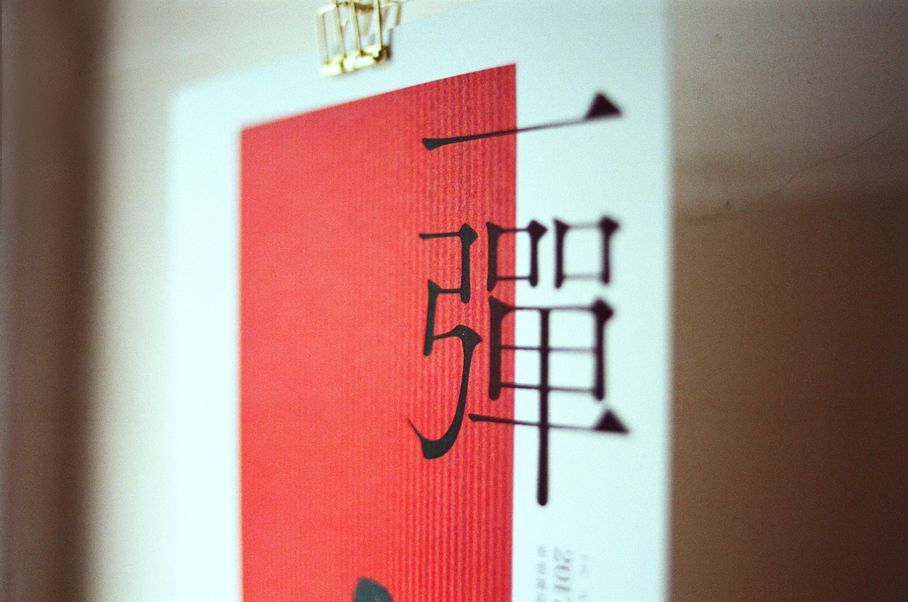
Poster Size: 20inch x 30inch
Paper: Options Vellum PC White 104 gsm
Printing: 4C + Matte foil in black on show name
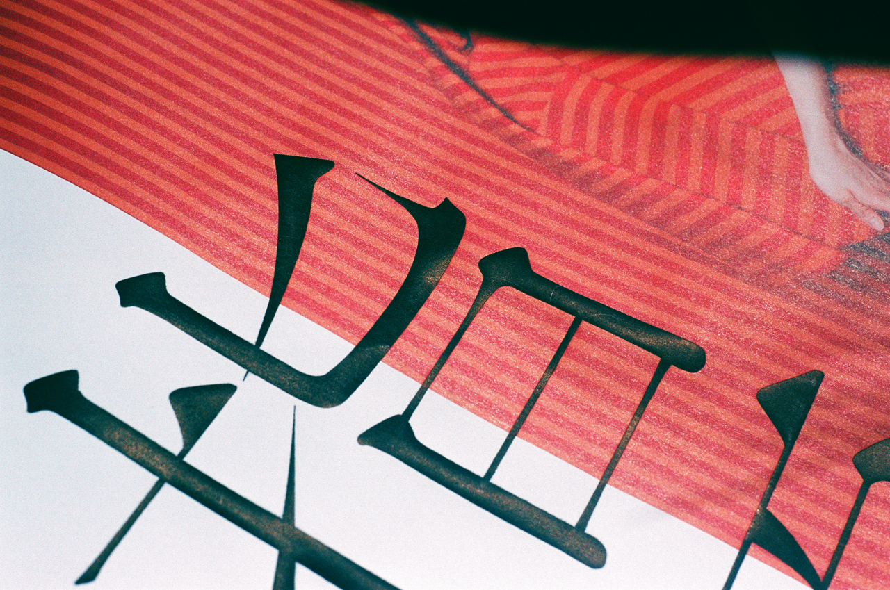
Foiling the title in matte black ink would leave a bumping imperfect stencil mark surrounding the four Chinese characters. Along with the matte foils, both help creates human texture in a subtle way. Lightweight uncoated paper in warm white is selected to create associations to book, literature, arts… When you can touch the design substance, you would probably feel the substance of the performance. The heavy stencil marks on a lightweight paper create an interesting contrast, which out-stands the visual weight of the title.
L e a f t l e t
Leaflet Size: 155mm x 230mm ( Double sided )
Paper: Options Vellum PC White 352 gsm
Printing: 4C + 4C+ Matte foil in black on show name
H o u s e P r o g r a m m e
 Booklet Size: 200mm x 200mm
Pages: 20PP ( Cover+inside pages )
Cover Paper: 300gsm Coated paper
Content Paper: 160gsm uncoated paper
Printing: 4C + 4C
Finishing: Saddle
A red loose knotted rope is added to the house programme as a touch. One main reason is to create the intimacy between dancer and audience, while red is in the costume throughout the show, the line is like part of the dancer.
A c h i e v e m e n t
The design successfully won a full house record which seldom happens to the organizier, Hong Kong Dance, one of the three traditional dance performance organizations in Hong Kong.
It proved quality design helps sales!