2 Months
Project
Project
![]()
2 Months Project1-ON-1 / at General Assembly
2 Months Project


We thought what do newcomers need is to teach them everything at once, but what they actually need is to be seen by everyone.
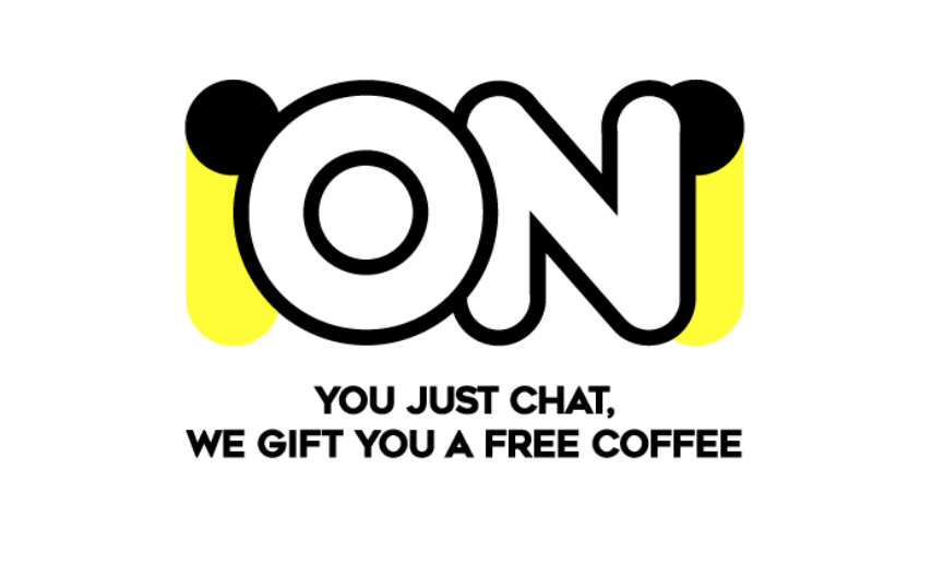
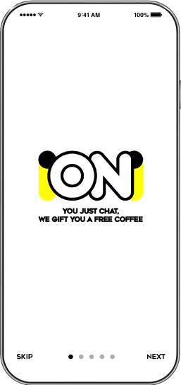
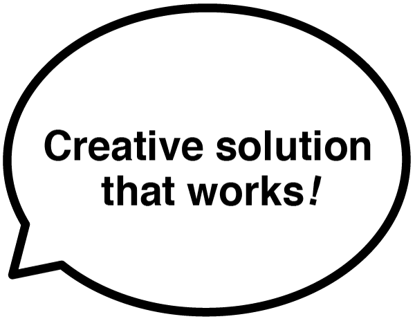
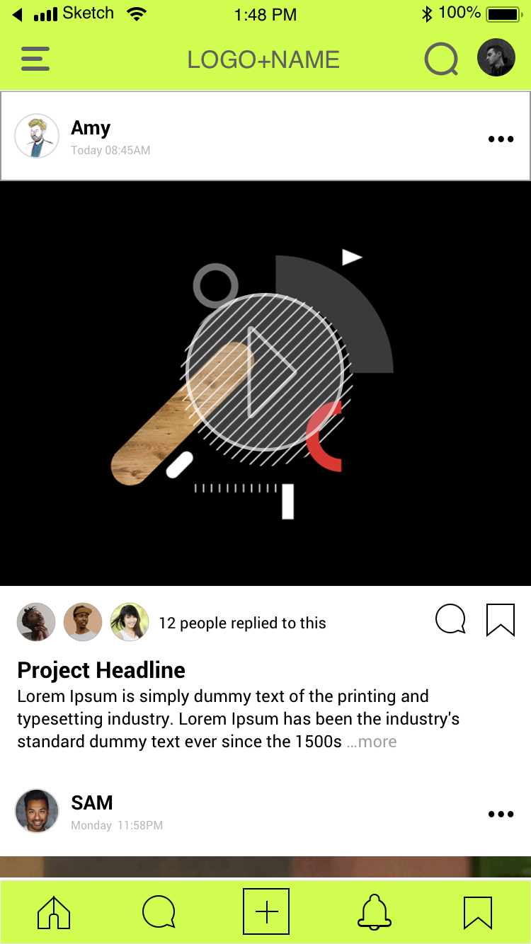
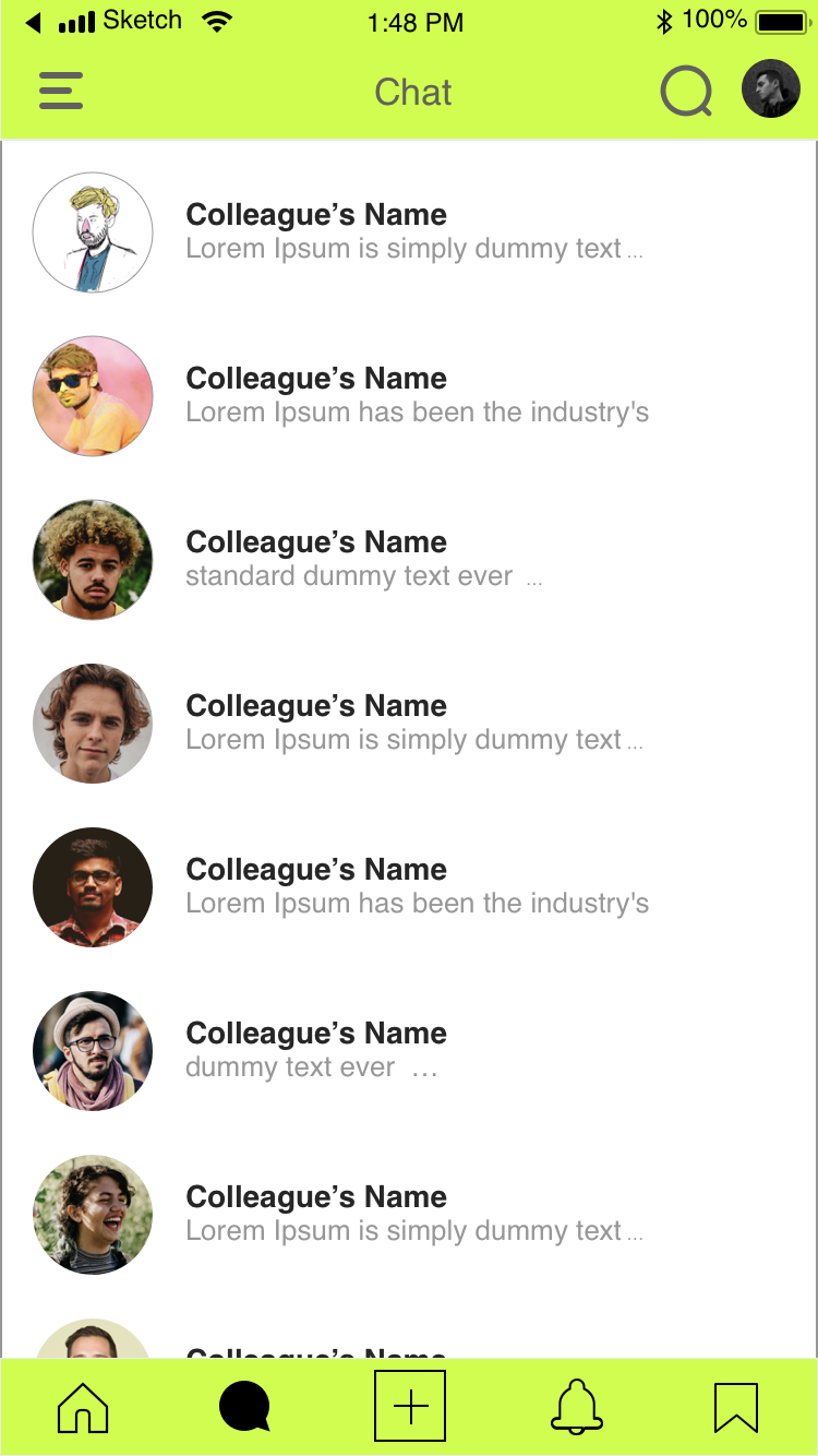
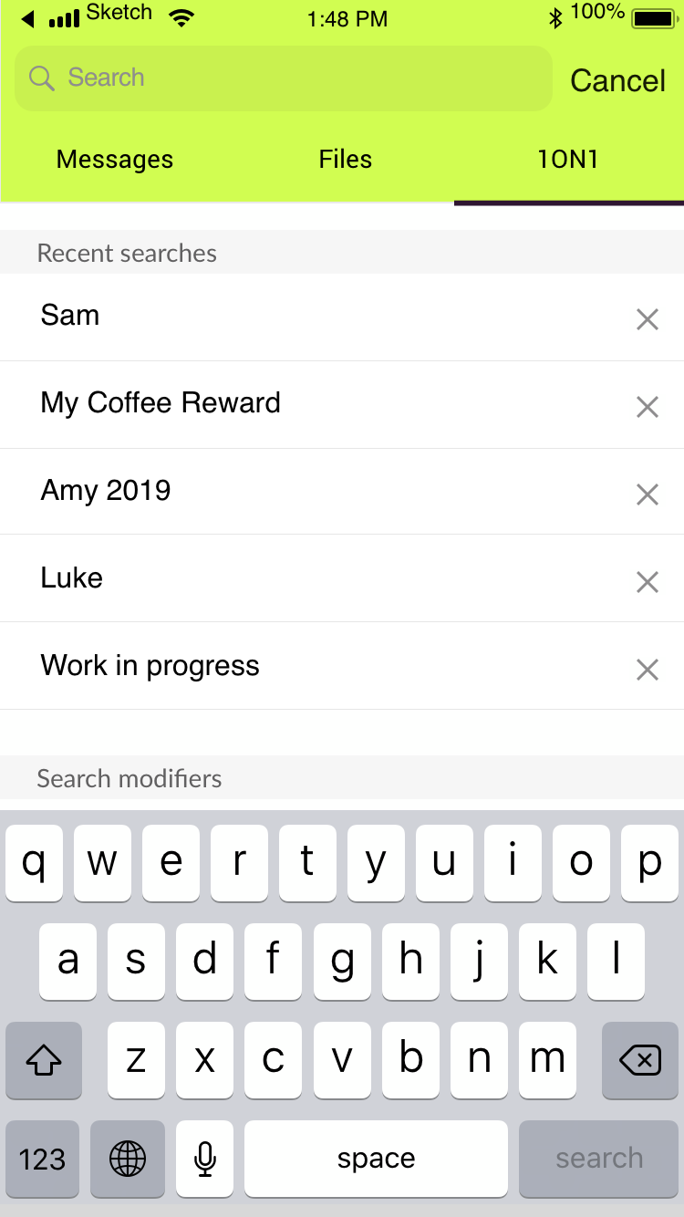
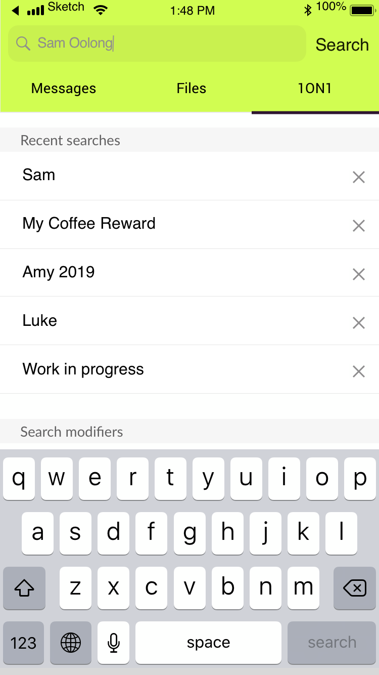
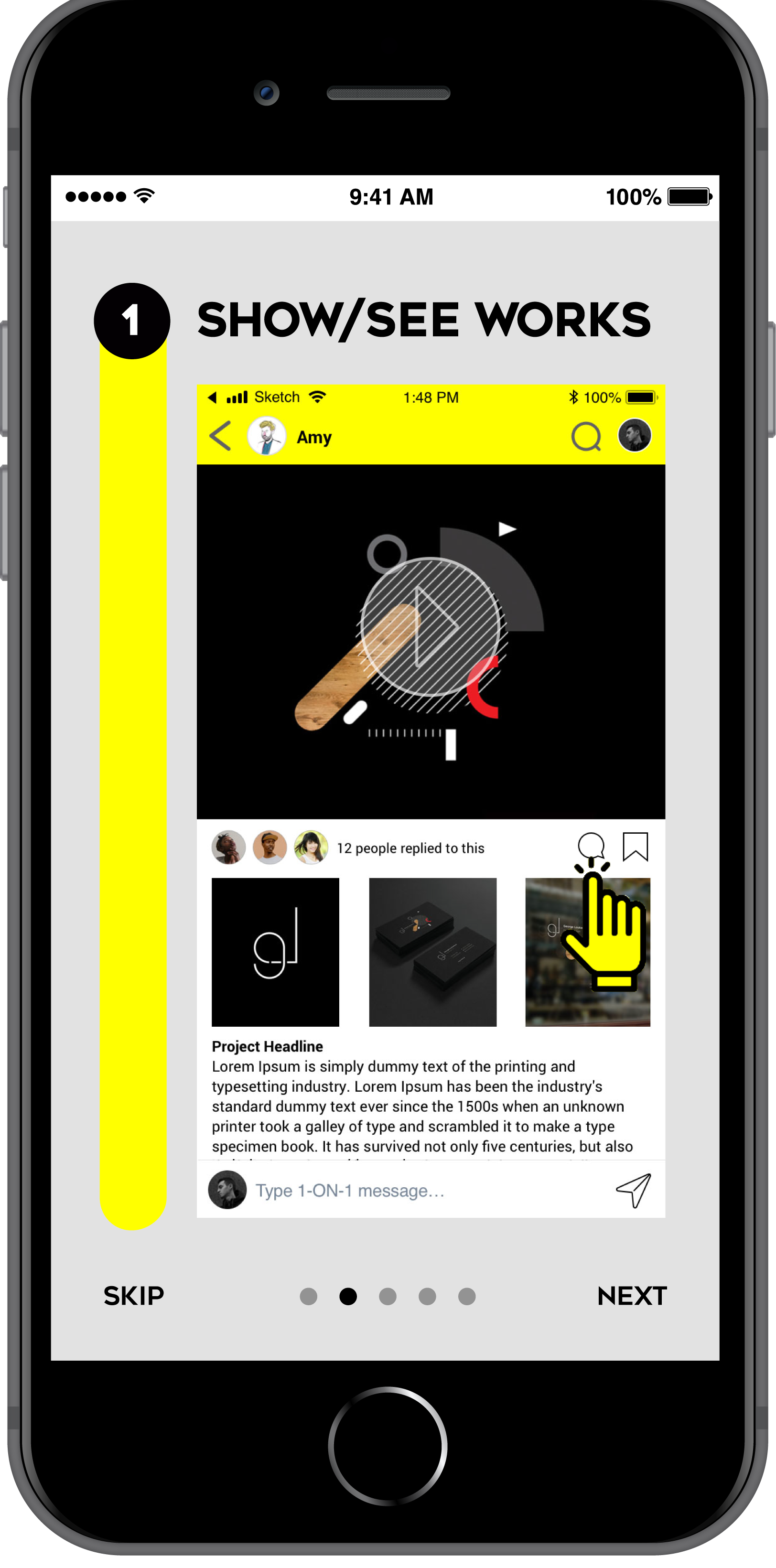
Let everyone see you at work in 3 steps
- See/Show works
- Talk about it
- Rewarded a free coffee, on us
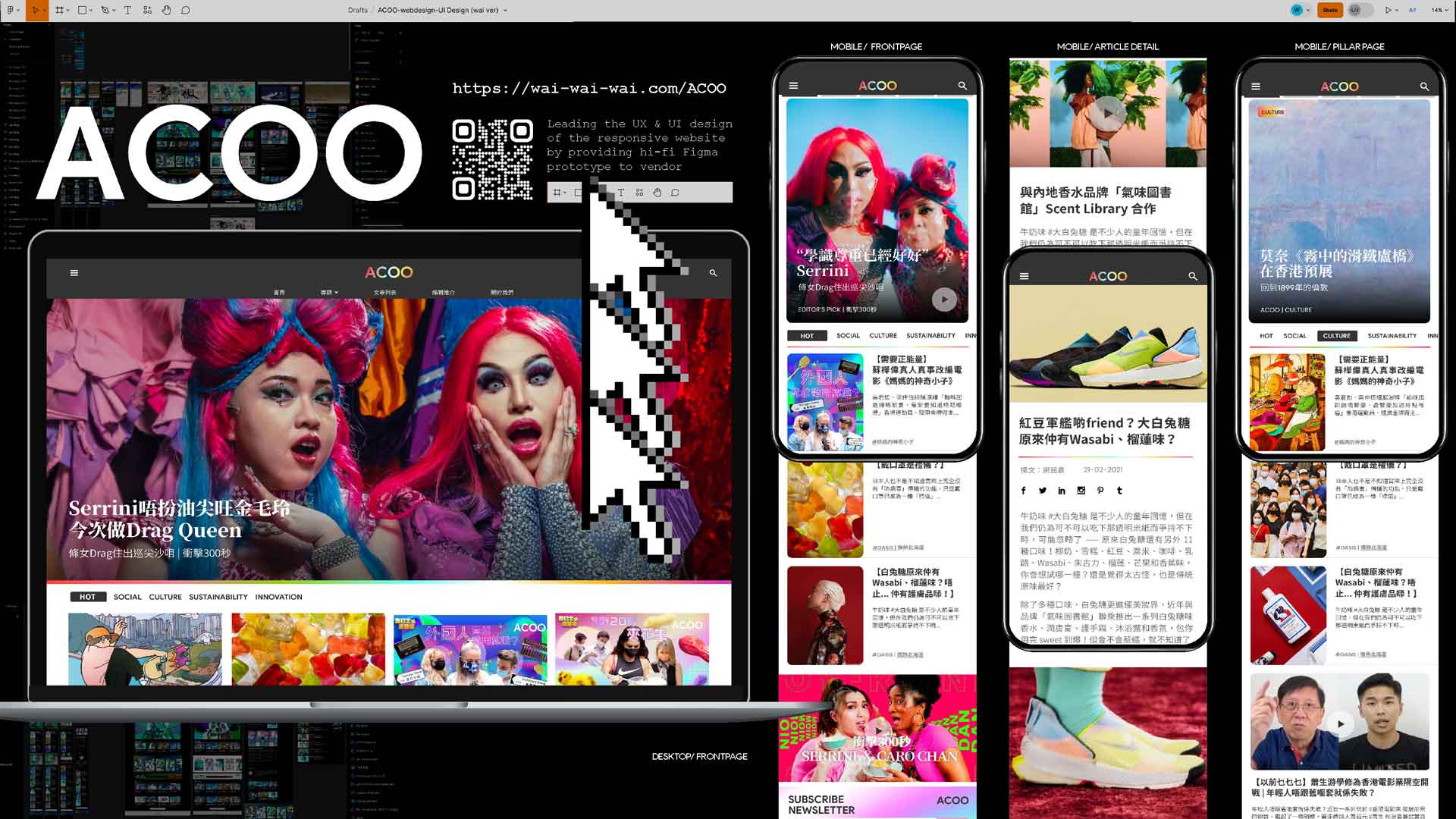
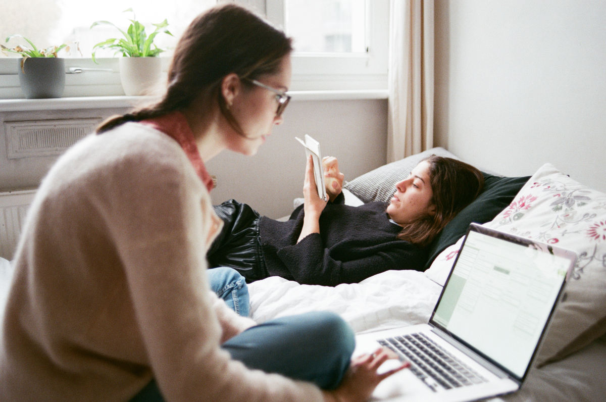
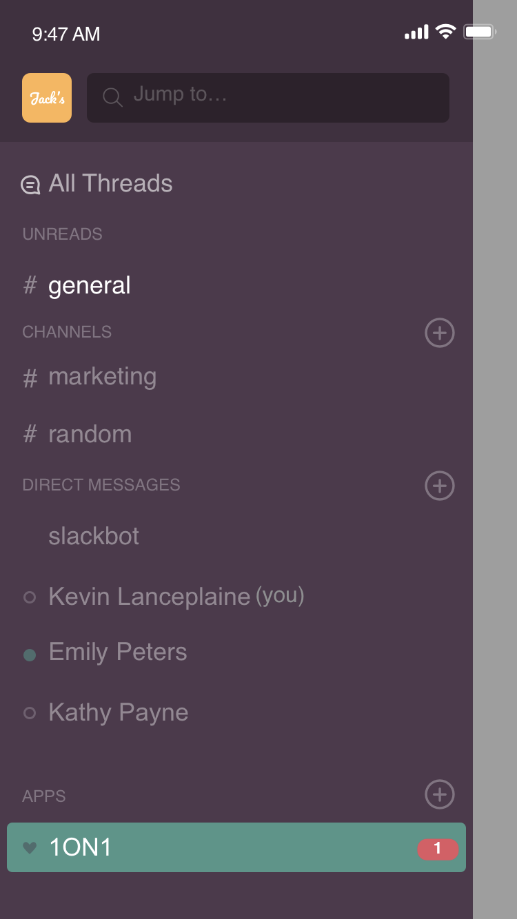
1ON1, a causal works sharing platform encourage 1-ON-1 conversation in office.
Description:
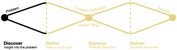
A marketable solution pin-pointing the key problem identified from user researches: User is in lack of recognition from colleagues due to the colleagues share little understanding of user’s work experience built from his/her hometown.
This is a 2 months intensive User Experience Design Project with extensive research on both market & users, analysis on stakeholders' concerns and difficulties. Worked towards a high-fidelity prototype that effectively solves the pain points backed by user tests.
Identifying key problems that new Londoners truly encountered and designed and marketable/ pragmatic solutions, balancing the needs of stakeholders.
Date: Sep-Nov 2019
Role: UX Designer + Brand Designer
City: London
UX techniques
Market Research (Competitive map, Features analysis, Comparative analysis), User Research (Research Plan, User Interviews, Guerrilla testing),
Define Problem Statement, Prepare Discussion Guide, Persona Set Up, Feature Prioritization, User Flow+ Happy path, Sketches ( Lo-fi annotated wireframe ), Site mapping, Card sorting ( Closed card sorting and analysis ) User Tests ( Lo-Fi & Lo-Fi Wireframes ), Prototype ( Hi-Fi InVision Clickable), Task analysis, Branding, UX writing, Project Proposal Writing, Presentations to stakeholders
UX Tools
Sharpies, white boarding, Colourful post-its, Invisions & Sketch, Adobe illustrator (illustrations), alongside loads of “Why”, a pair of good ears, and Empathy.
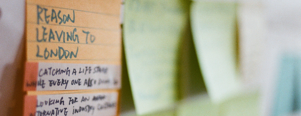
Divergent Research
Who?
London newcomers
Why?
London, one of the most ethnically diverse cities in the world. 37% of people in London are born outside UK, according to the census report*.
The Huge number of newcomers = Huge problem space.
What?
What is the problem are new Londoners actually facing?
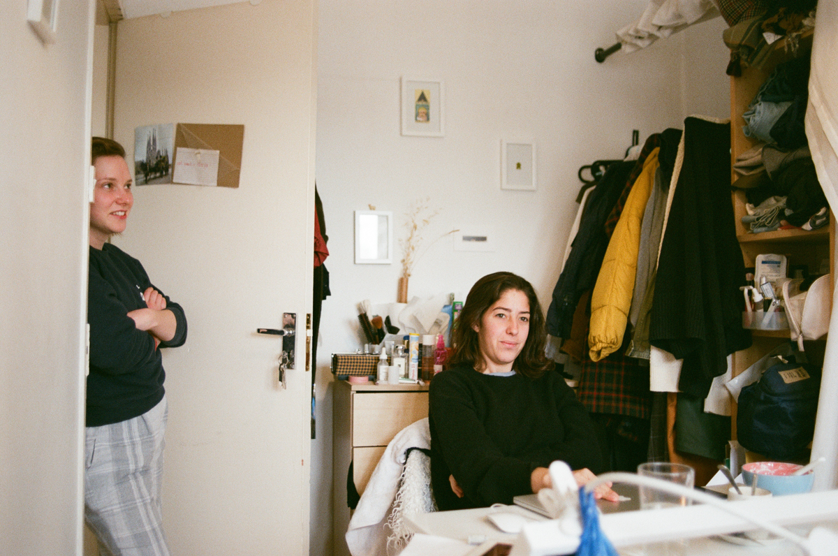
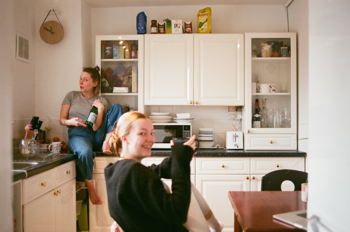
Speaking of my personal experience, it was such a hard time to get a life set up from scratch upon moving to a new country, knowing no one and having zero connection in my profession.
Thus, to begin with, I started the project with
Problem statement ( before Pivot ):
“New Londoner needs a way to set up a life from scratch, because they do not have enough local information nor network to help getting start, it creates a hard time.”
Problem statement & Hypothesis
Competitive Analysis
Research Plan
Discussion Guide
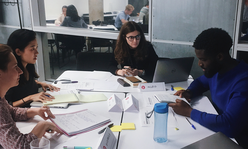
User Research: Interviews
4 interviewees who are new to London 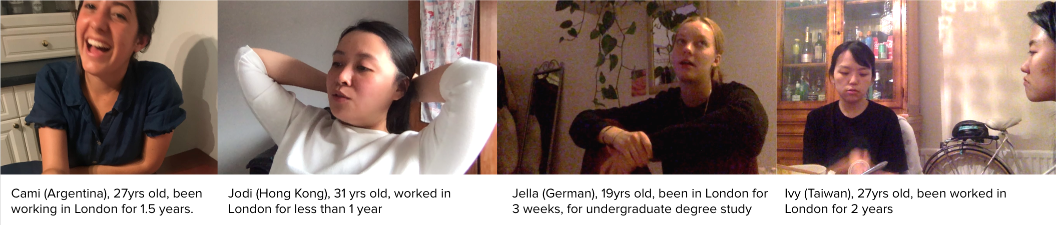
PIVOT
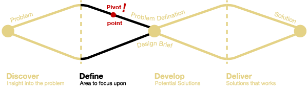
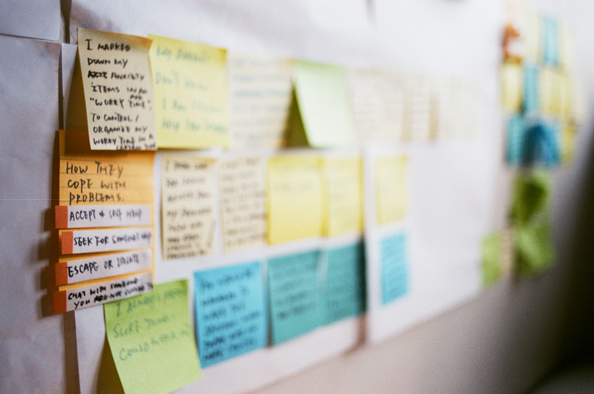
Findings from user interviews had brought the project to a PIVOT.
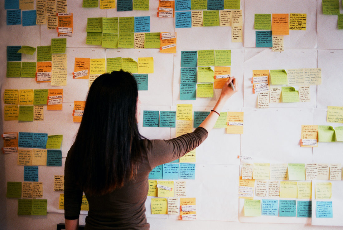
An interesting result was found after the affinity mapping
User Interviews Key-takeaways
-
User see everyday problems as new experience
It shows although newcomers did experience lots of everyday problems when they start a new life. They don’t see it as a big problem. In contrast, they see those challenges as a new experience indeed
![]()
-
Problem pop up after a period a time rather than upon arrival
Unexpectedly, the most significant problem they have encountered does not happen upon their arrival but after a certain period at work. The fact is, newcomers moved from a different city, their previous working experience was built from their home countries where little in the office is familiar with. Newcomers face a problem about couldn’t receive recognition from everyone in the workplace. They might be acknowledged by someone who hired them, but not from the same level co-workers nor junior.
![]()

-
Little recognition on their hometown experience
In Jodi’s case, who supposed on the senior level in Hong Kong, she’s been regarded as a mid-weight level in the company. She felt being undervalued whenever co-operating with teammates, and constantly doubted the incapacity of her line-manager.
![]()

- Weekly therapist treatment for work depression
In interviewee Ivy’s case, she has been recognized by the management team and promoted her as the team manager. However, she has constantly been doubted and looked down by her junior teammates about her seniority and capability.
Why I see work recognition as the key issue because not only one person in the user interview has experienced depression due of that. Ivy even needed to seek help of the therapist weekly because of the anxiety caused by work environment. I believe it is the main problem of new Londoners urging for a way to solve.
![]()
![]()


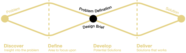
Updated Problem Defination
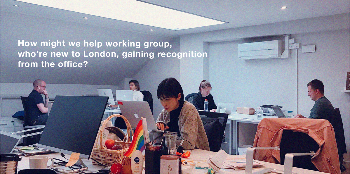
What? How might we help working group, who are new to London to gain recognition from the office?

Updated Problem Statement
Updated Problem Statement
Ivy needs a way to help her manage to take the senior role. It’s because she wants everyone in the office could recognize she is a qualified person to entitle more.
(This is the primary problem statement among 4, click to see details )

Challenges
Recognition takes time
Gaining recognition is a long term process that takes time. It is not a problem that you would solve in 10 minutes of time by using an app.

Prioritization Matrix
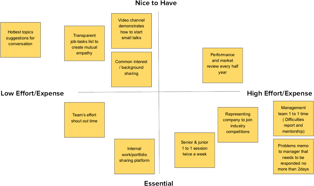
In the feature prioritization (solution ideation), I found that constant communication such as 1-ON-1 seems to be the best way to build up
mutual recognition and bringing a positive working relationship.
Wider scale of stakeholders involved
After scoping down to “create something for office”, many more stakeholders have been involved added up many considerations. The challenge at this point was to come up with a pragmatic solution that is able to balance needs between users, colleagues in the office and the company. Especially it’s tough to rationalize “Why the company needs to pay for the staff to build recognition among the team”.
Competitive Map
Competitive Map
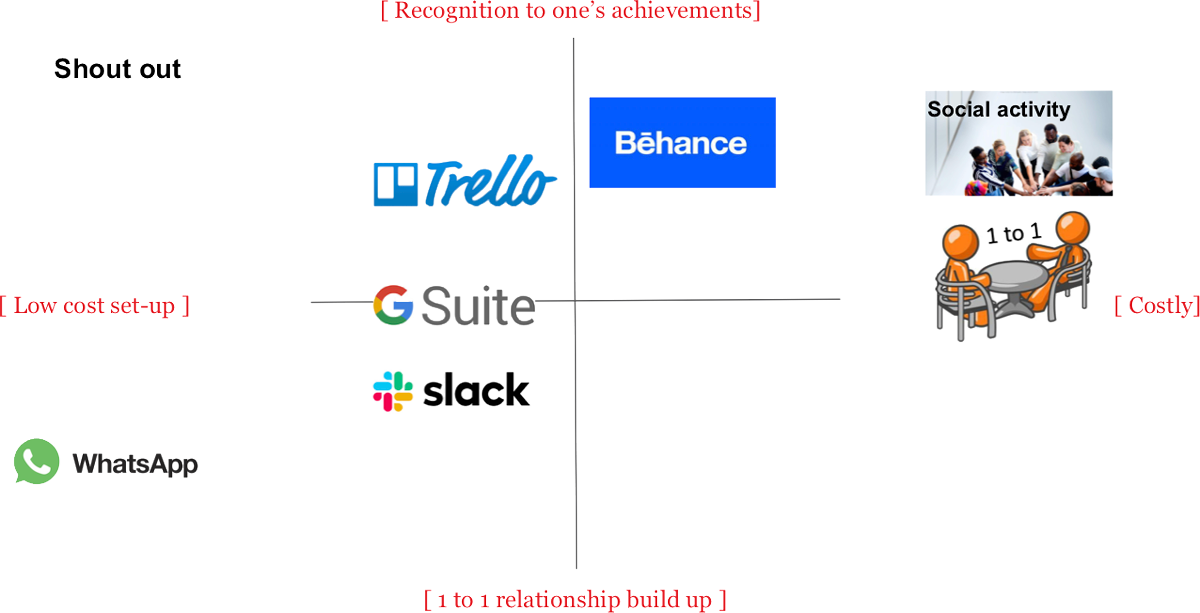
Feature Comparison Matrix
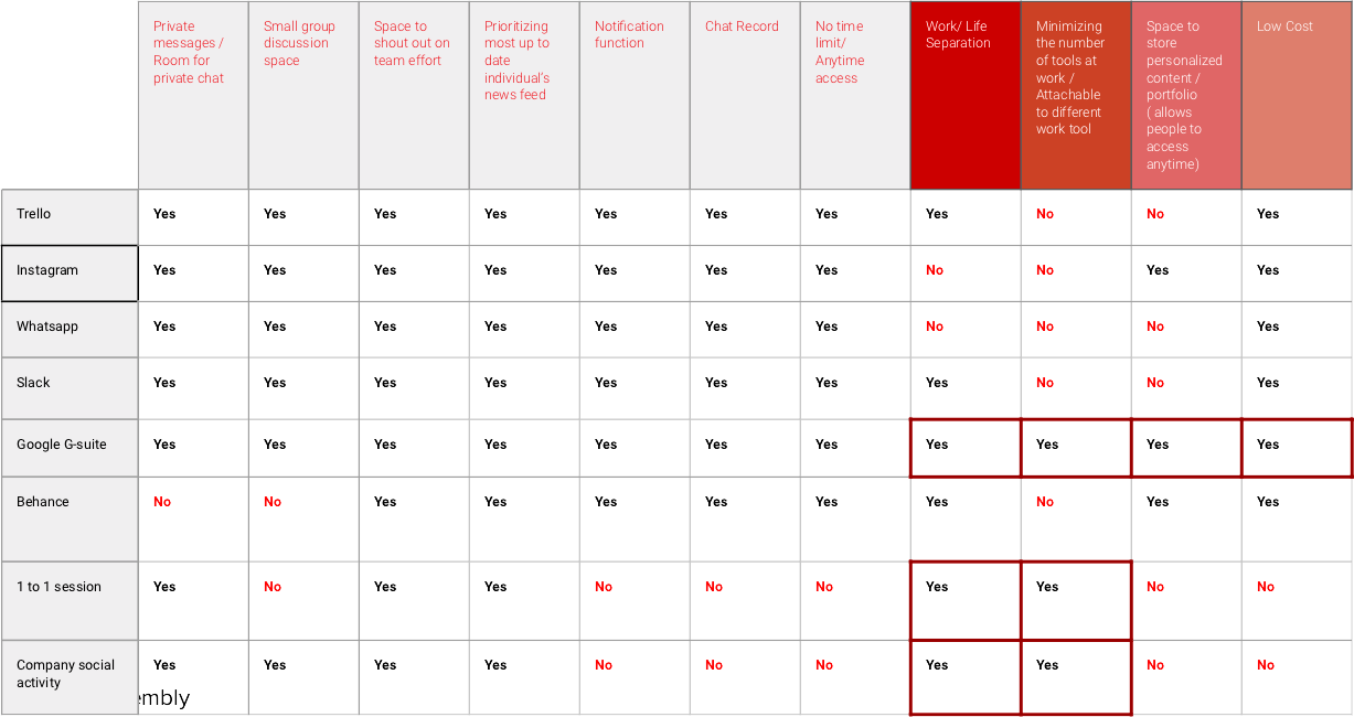
Looked into the potential competitors and their features comparisons, G-suite has the highest potential to achieve most important needs from different stakeholders in terms of

The matrix provides the product design direction could be a platform attachable on existing work tools, like G-suite.
However, rather than wait until one day someone in the office to coordinate all G-suite tools to solve our user’s problem.
It is always a good idea to proactively solve the problem:

SMALL TALK
Group discussion brings views, 1 to 1 conversation builds work effectiveness!
A platform encourages 1 to 1 SMALL TALK, at work.
Mutual recognition smoothen work partnerships = Effective working environment
To meet the core user goal, “wants to be recognized by everyone that she is a qualified person to entitle more” ( a.k.a Efficient working environment in company’s perspective), by creating a talent/portfolio sharing platform that facilitates and encourage 1 to 1 communication focus at another’s achievement. 1 to 1 casual conversation creates synergy accelerating relationships among staffs, private talk creates room for honestly, understanding and trust. Group discussion helps little on 1 to 1 bonding. What to talk about? The folio/updates embody as the topics
Balancing needs of stakeholders
Thus, the creative idea “Small talk “ is created. A causal works sharing platform that encourage 1 to 1 communication focus at another’s achievement.
“Small Talk”, in contrast with group chat. Believing 1 to 1 casual conversation creates chemistry accelerating bonding among teammates that group discussion couldn’t do - Private talk creates room for honestly, understanding and trust. And the folio/work updates create some topics to talk to. (Needs of users)
I hope through the constant communication about personal achievements could bring recognition. (Needs for Users)
What’s more, mutual recognition smoothen work partnerships = thus to create an effective working environment (Needs for Company)
- “Why the company need to pay for the staff to build recognition among the team” ?
(Entrprenuer’s need)
![]() Same effectiveness, lower cost to the company
Same effectiveness, lower cost to the company
Extra social activities / 1-ON-1 session means higher cost and lower margin of deliverables of the company
 Same effectiveness, lower cost to the company
- How to ensure peers in the office would use the product to achieve the user’s goal? (User’s need + Product designer’s need)
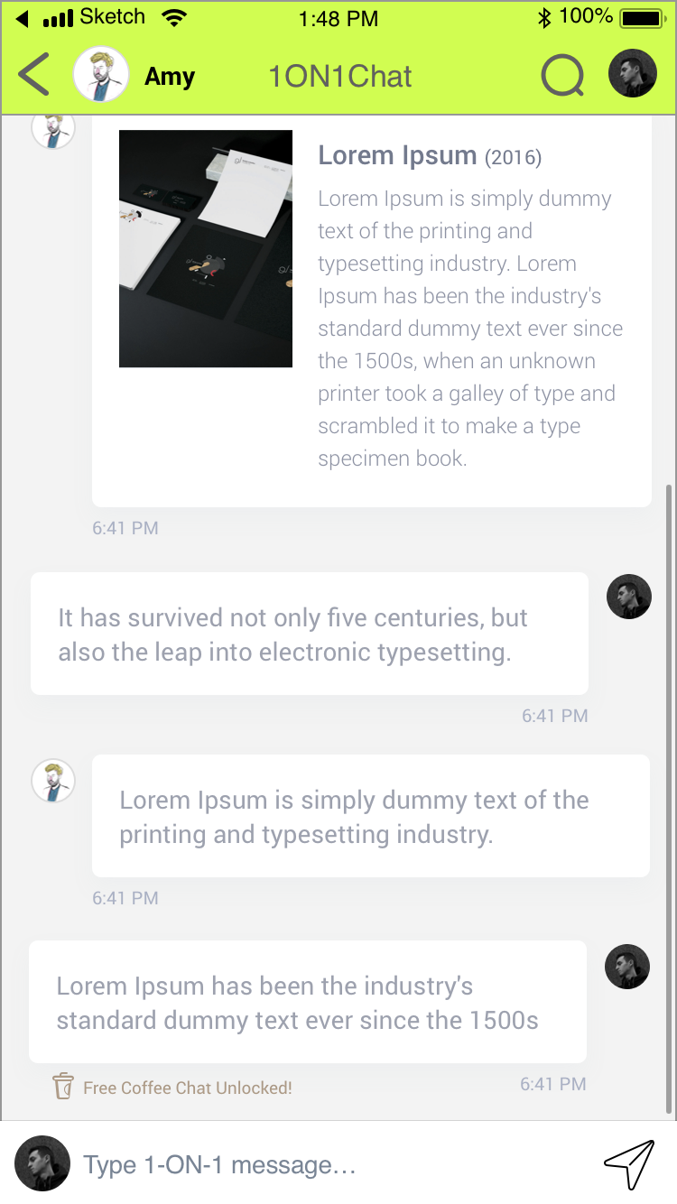
![]() To ensure the platform could work actively and effectively, there is one unique feature on the app: once you complete a 1 to 1 private chat on the platform, you and your colleague would be rewarded a free coffee. From the company perspective, it could serve as a rather low-cost alternative to replace extra social activity or a 1 to 1 session in the office. Worth it!
To ensure the platform could work actively and effectively, there is one unique feature on the app: once you complete a 1 to 1 private chat on the platform, you and your colleague would be rewarded a free coffee. From the company perspective, it could serve as a rather low-cost alternative to replace extra social activity or a 1 to 1 session in the office. Worth it!
The Project Proposal
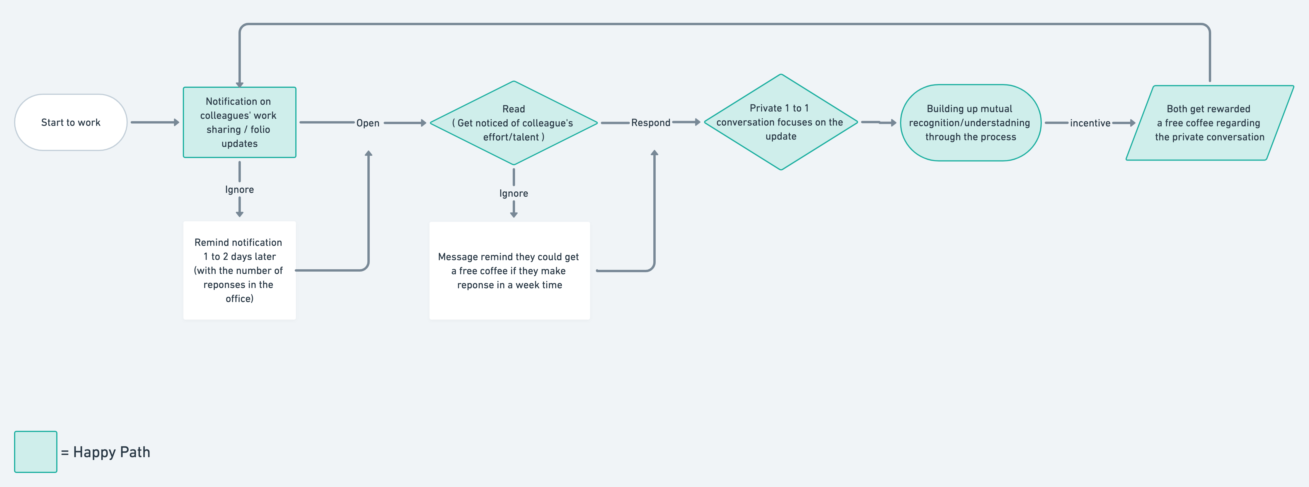
User Flow + Happy Path
User Flow + Happy Path
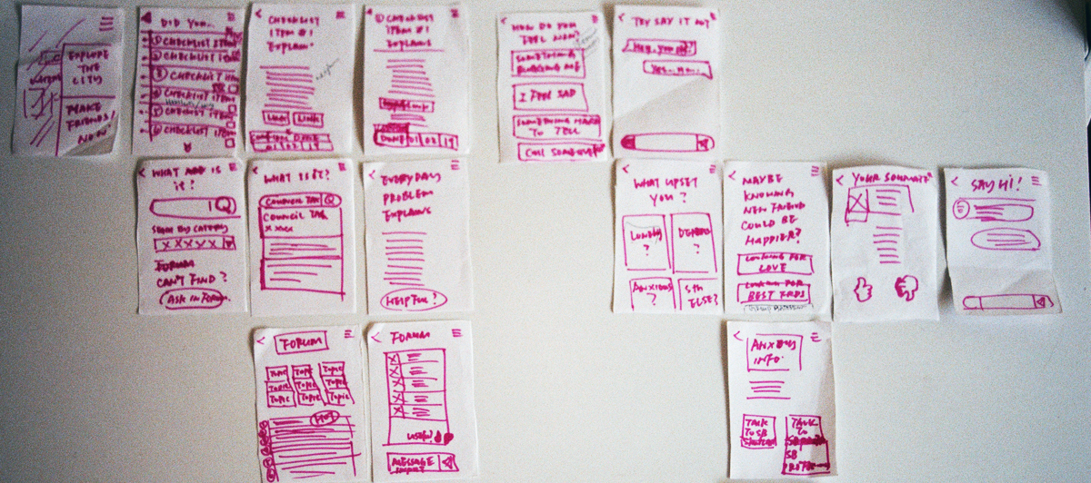
Sketches ( lo-fi annotated wireframe )


Site Map

Card Sorting
To ensure the product could apply to the diverse ethnicity users, participants in different ethnicity had been brought in the card sorting exercise: 1 Indian, 1 German, 1 Argentinian, 1 Hong Kongese.
Card Sorting Result
The card sorting result is quite positive, testers were able to sort cards in the designed category. Overall, the wording might make some confusions but that could be addressed by visual icons instead.
UI Design Inspirations
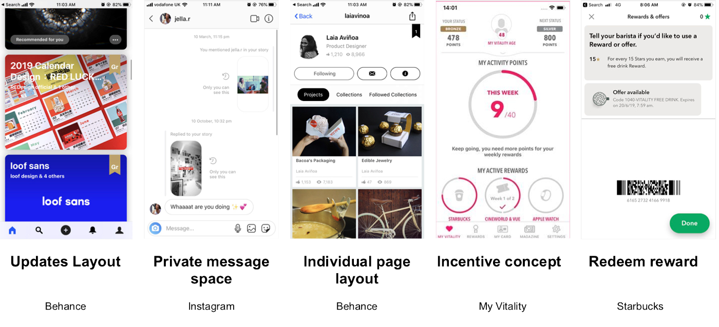
Referencing to portfolio sharing portal “Behance” has helped me form the skeleton of the wireframe.
I believe it would be also good to borrow design everyone uses nowadays, such as Instagram, to skip the pickup time of the user to adapt a different UI design.

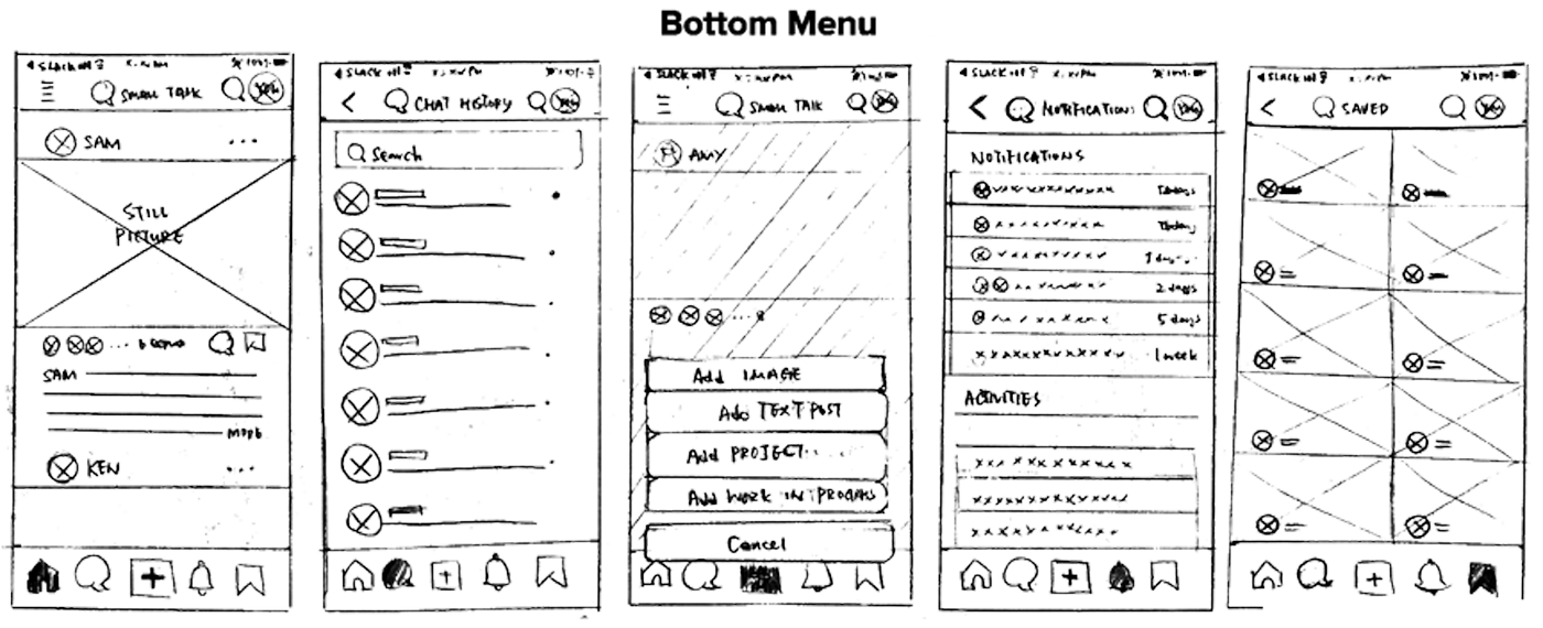
Key Screens
( Lo-fi wireframes to conduct user test )Flow ︎ Left top to right bottomHappy path ︎ Complete private conversation on one’s participants post to get free coffee
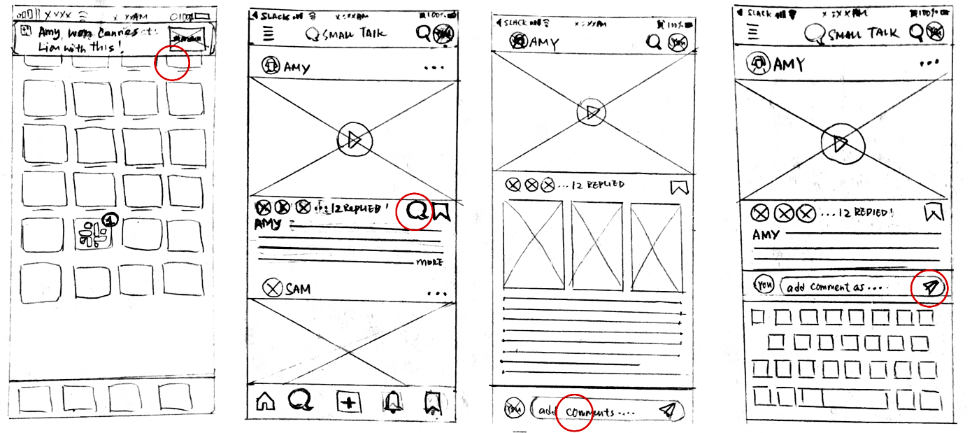
Click on Notification on
Home Screen / Slack
Home Screen / Slack
Been directed to the post
and leave a message
and leave a message
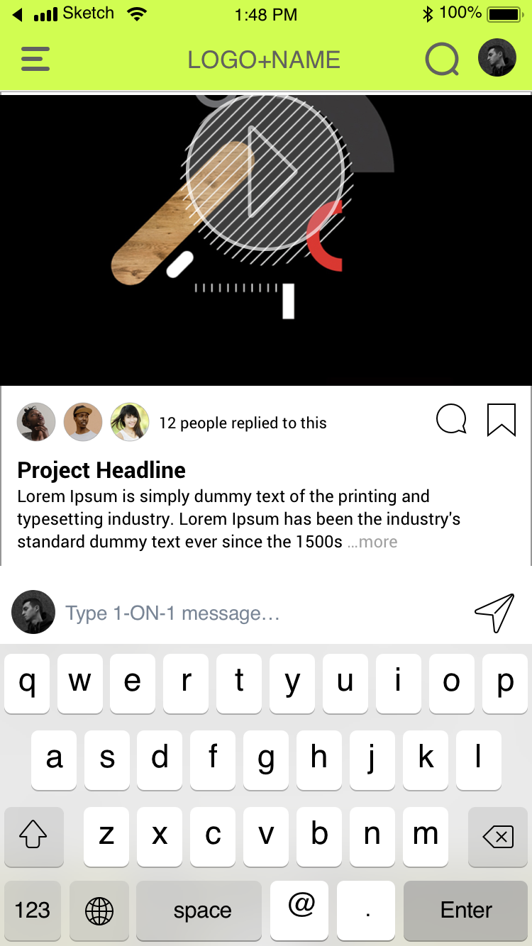
Type message on text bar
Send
Once message is sent,
it pop as a private chat window
it pop as a private chat window
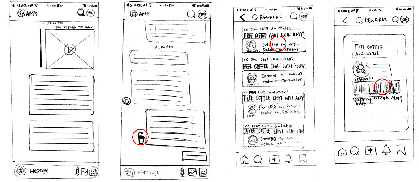
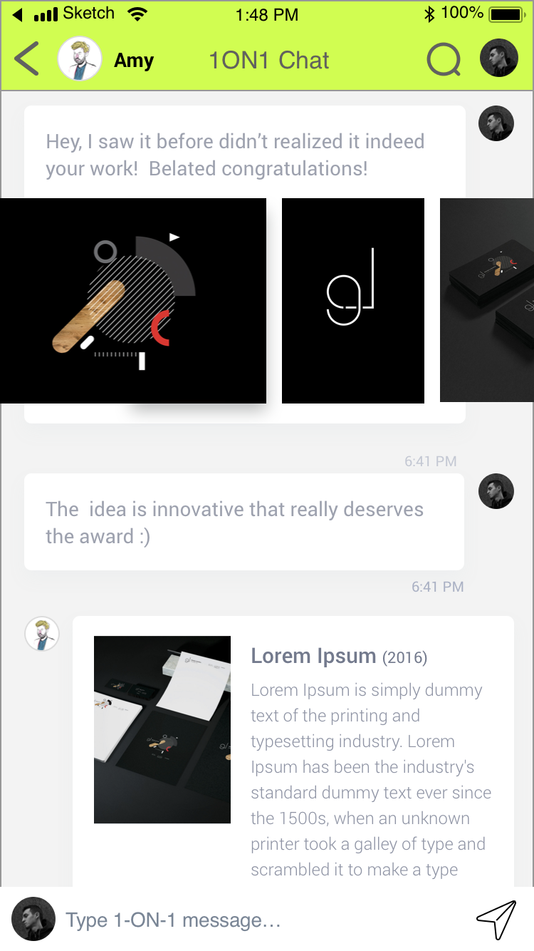
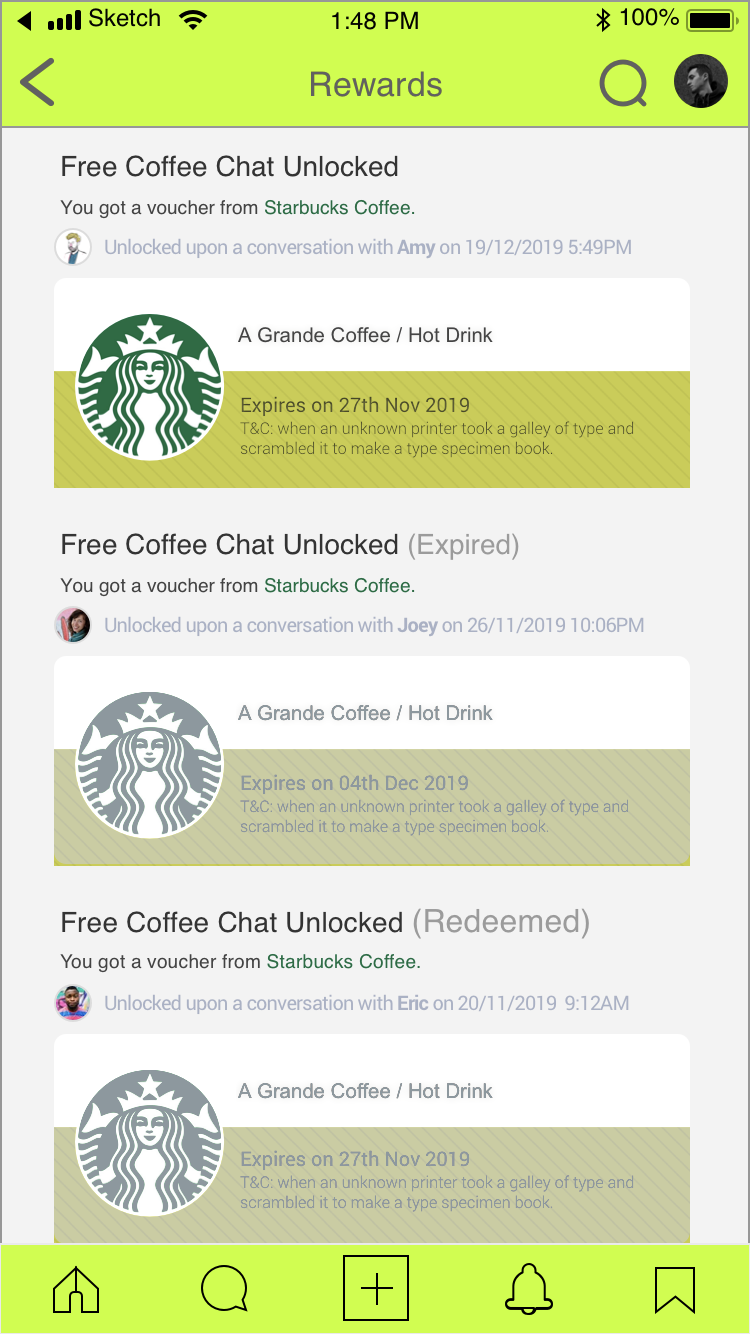
Chat continues, once both replied, “Coffee unlocked” icon would be shown alongside the next message box
A new free coffee coupon
will be shown on
the Reward page
will be shown on
the Reward page
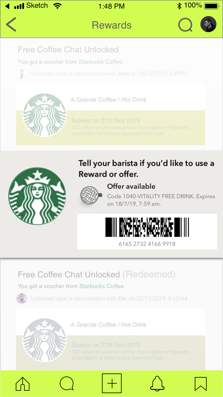
Tap the coupon.
Redeem the free coffee by scannig the coupon barcode at the cashier
Redeem the free coffee by scannig the coupon barcode at the cashier
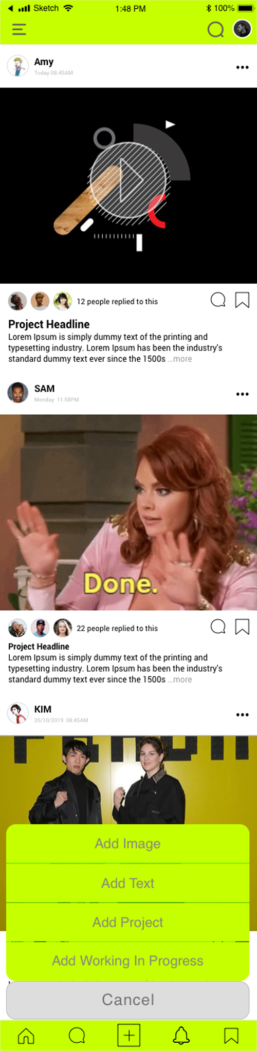
Rest of Screens
( Lo-fi wireframes to conduct user test )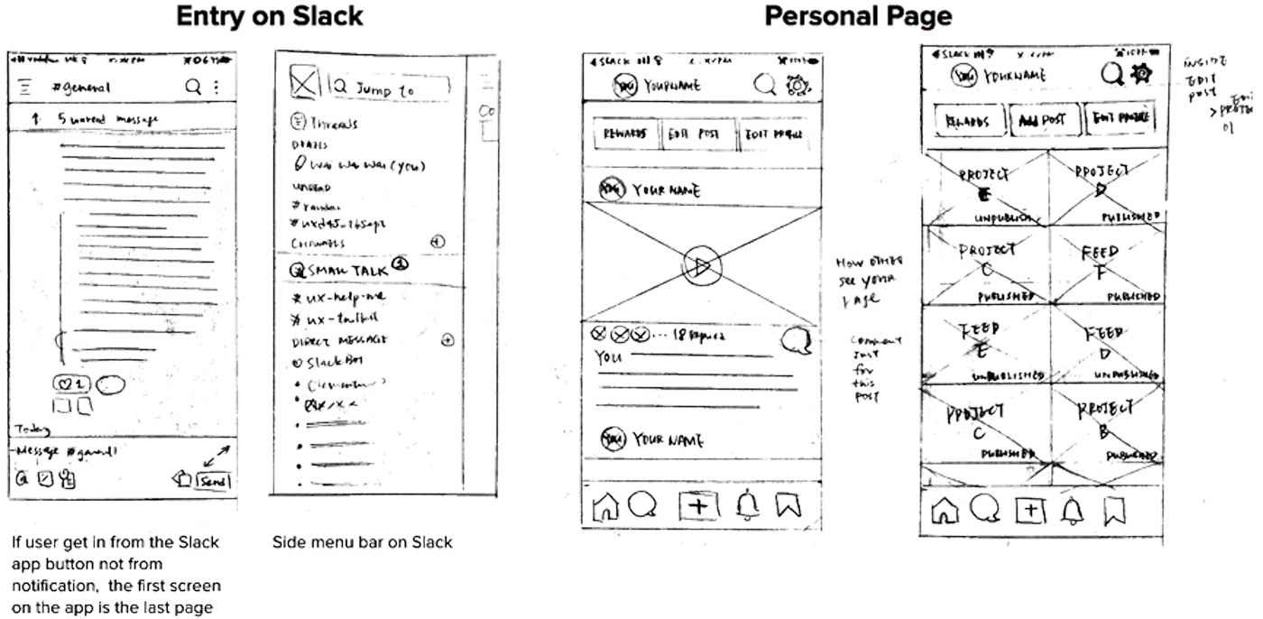

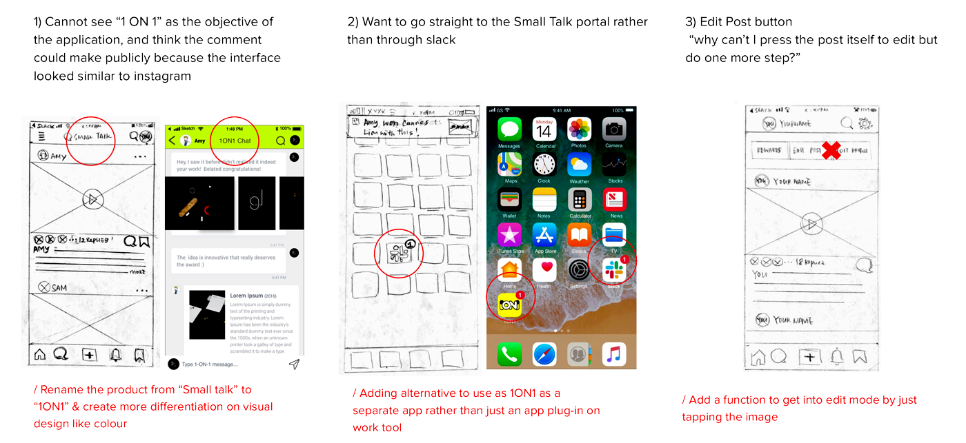
Lo-fi wireframes user test | key takeaways
& corresponding update
I use the above lo-fi wireframes to conduct my first user testing.
Key-takeaways:
- Cannot see “1 ON 1” as the objective of the application,
- Think the comment could make publicly because the interface looked similar to Instagram
- Want to go straight to the Small Talk portal rather than through slack
- Edit Post button “why can’t I press the post itself to edit but do one more step?”
Hi-fi Wireframe Prototype
(for main tasks: see works, chat & redeem coffee )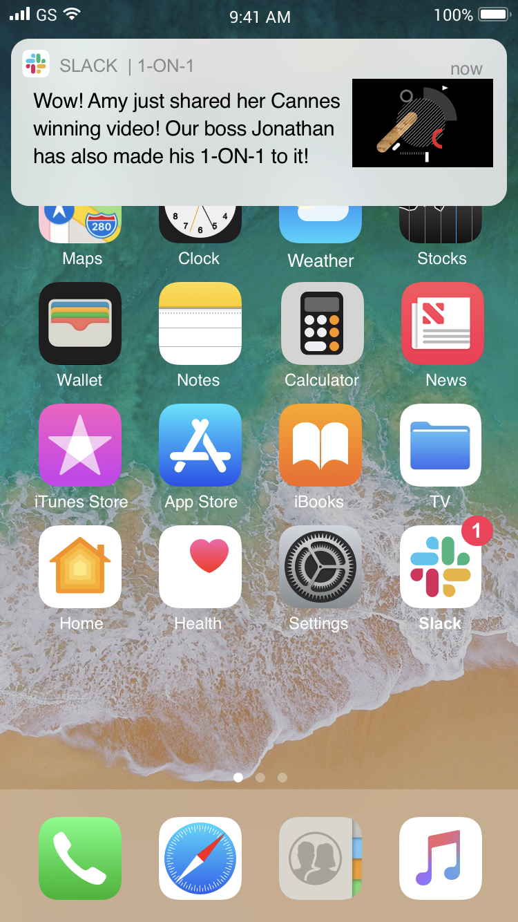
Hi-fi Wireframe Prototype
( for more tasks : search someone’s works; browsing personal page; add posts, more navigations pages)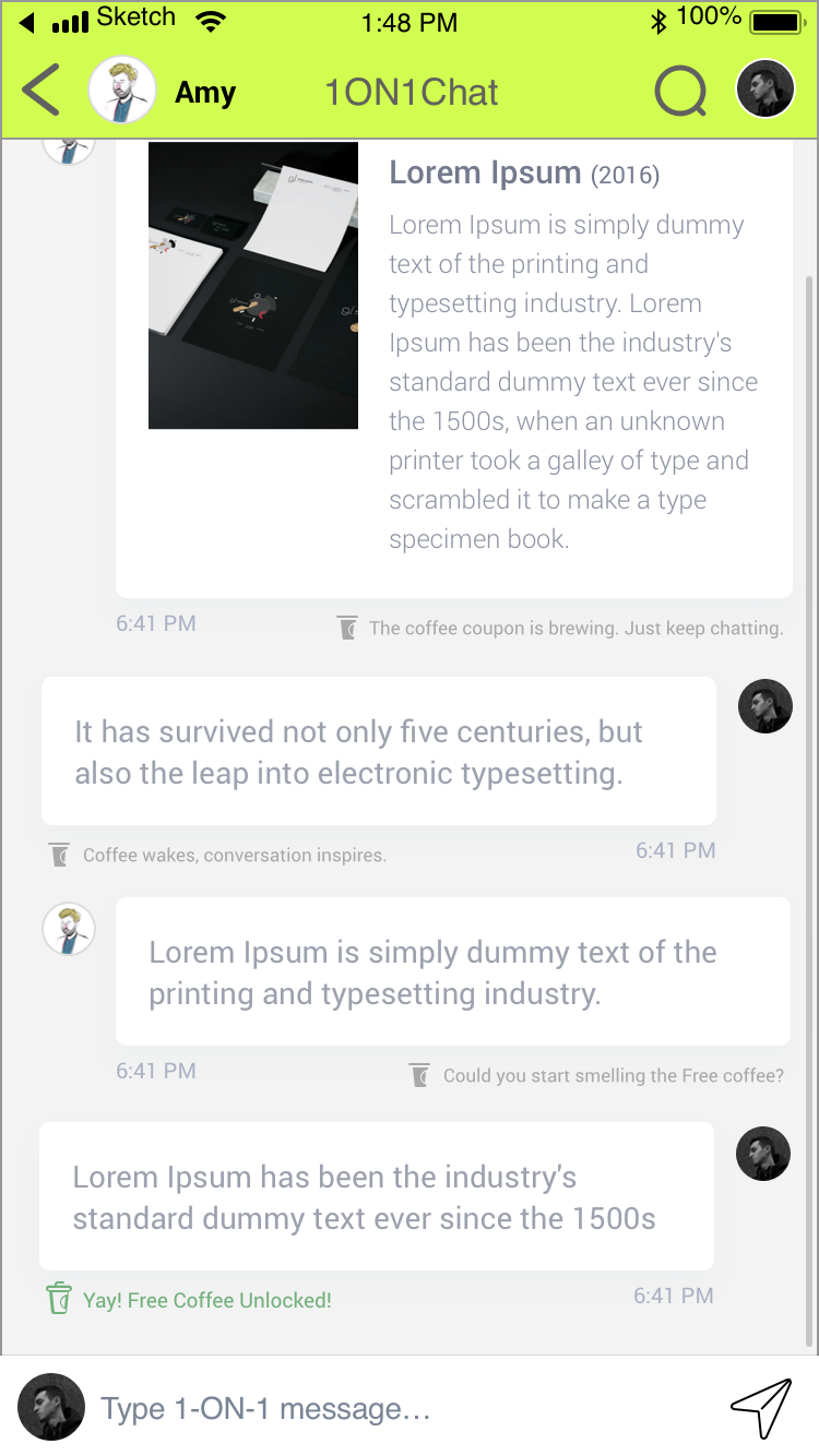
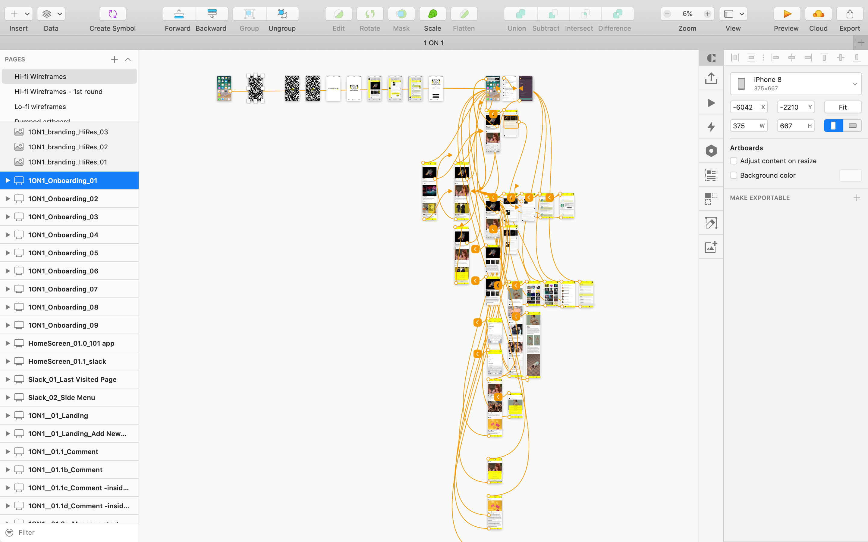
Clickable Hi-Fi
Prototype
Usability Test Plan
1st Usability Test Result
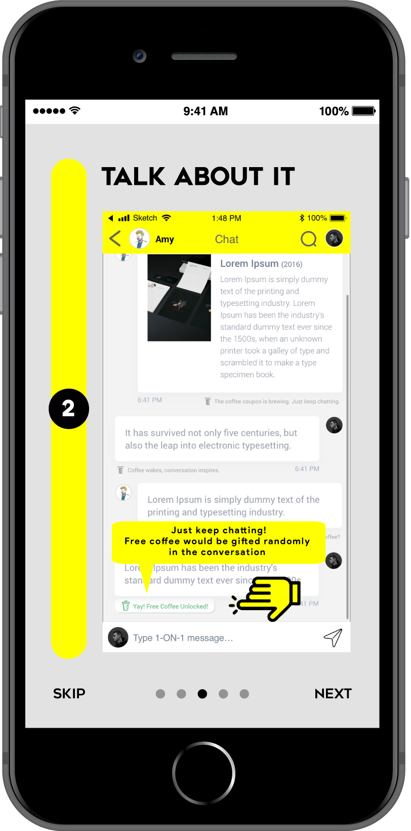
Overall, users can complete task 01 and 02 but not task 03. Because they couldn’t see the “Free coffee” message, which was the hint to them and direct them to the reward page.
Corresponding Revision
Add hints about the free coffee since the first message, more like teasing messages, letting user know as long as they keep chatting, the free coffee is on the way.
Users would also look for reward via notification page and search so I added the functions correspondingly.
Users seldom use “my profile”, which is quite different to my expectation, so I make the avatar looked more like a button by adding a white border.
Prototype design:
- although it is a prototype, still need to create more hints to facilitate the test
- minimize the” in between steps”as testers would be easily get lost when no motion/ transitions serve as the transitions on prototype
- add hotspot on prototype if they are supposed to have motion/animation
2st Usability Test Result
Corresponding Revision
Affordance: To address the unclear problem, I made the message like a button to enhance offer more hint for users to the reward page
A quick guidance has been added on boarding session and summarized into 3 steps to make sure users know where and what’s going on
Branding | Marketing idea

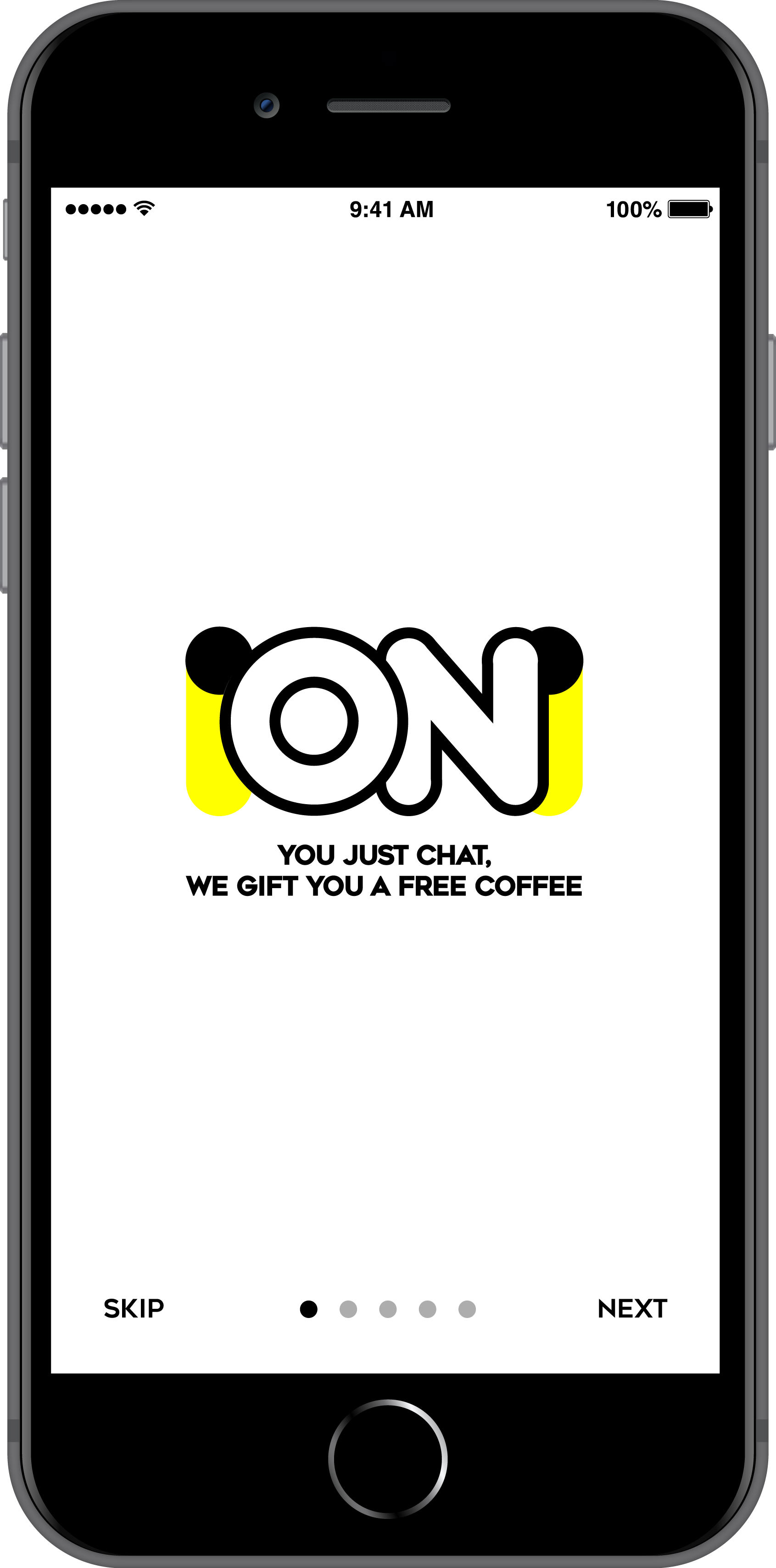
Product name:
The user test suggested the working name “Small talk” is insufficient to tell the key function “ a private chat with co-workers”. To bring this key function upfront, I put “1-ON-1“ straight away to be the product name, which is commonly used in workplace.Tone and manner:
Casual, approachable, human and modern. Emphasizing human connection from the cold and serious office environment.Communication ideas:
Stakeholders, Users, and investors need a sharp and clear tagline to know how the app solve their needs in one sec. The tagline “Let everyone see you” hit the user’s goal straight. It consolidates Why & What the problem is and the purpose 1ON1 serves in one short line.
“You just chat, we gift you a free coffee” highlight the incentive to users, grabbing user interest at the first 30 secs of onboarding.
UX writing:
“The coffee coupon is brewing, just keep chatting”; “Coffee wakes, conversation inspires”; “Could you smell the free coffee?”, “Yay! Free coffee unlocked!”.
The hints are written in light-heartedly tone to resonate with users' thinking during the 1-ON-1 chat.
The writing shows our understanding of users’ minds, keeping users engaged and guiding users to move forward in the user journey.

Visual Identity
Visual Identity
Colour:
Bright Yellow (R255 G55 B0) is the primary colour. The bright energetic yellow has rarely been used at work tools, it brings freshness to the workplace. The objective of this colour selection is to make the app easy to be registered, help to build up the visual uniqueness of the brand identity.

Bright Green (former primary colour) was selected but now changed to yellow, because it provides weaker contrast with the visual elements thus weaker readability than yellow. And the brightness might be too strong for the ease of watching

Logo Idea:
Human relationship takes the greatest role in our product. Private 1-On-1 conversation between colleagues is the key function we would like to emphasize. To bring this idea upfront, the “1” in the name has been visualized as a human shape featured in minimal style.
It also visually resonates with the “ON” mode of a switch button, which implies the 1ON1 relationship has been turned on.

Head
Body
︎
Human
shape
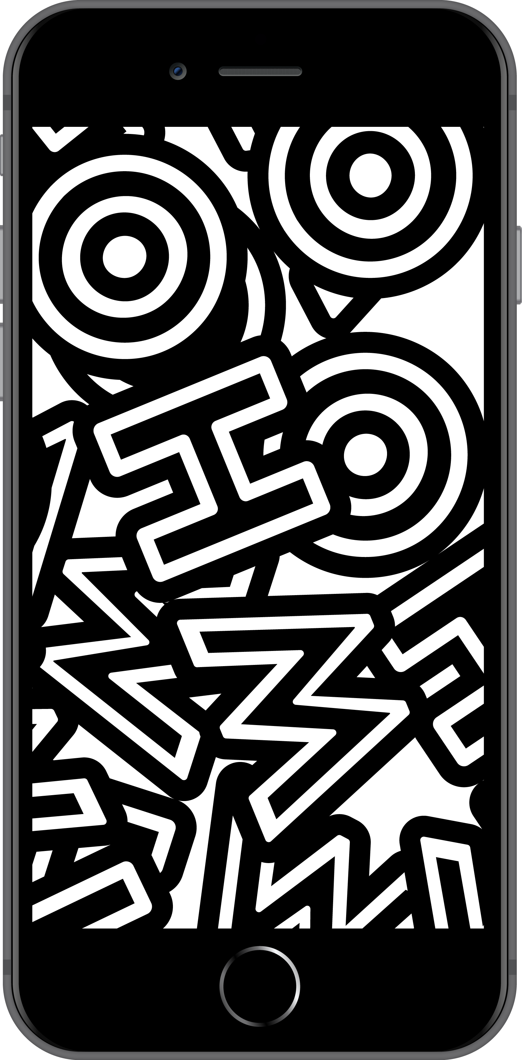
Splash screen animation communication:
The splash screen tells the be-seen-story by revealing the yellow man among the mayhem “WHO” sea, to further reinforce the marketing message “Let everyone see you”.
The yellow man connects all human implications throughout the splash screen, from transiting into the alphabet “O” in the tagline to the reveal of 1-ON-1 Logo, to detail the product idea in visual storytelling.


Onboarding


Presentation to stakeholders
Presentation to stakeholders

Clementine Brown
Principal Product Designer at Red badger
Principal Product Designer at Red badger
“Such great finding that what you thought was a problem was actually a new experience, very insightful of you to recognise that. And you created wonderful branding! Not only was it playful, it was also sincere, which is a hard mix to get - well done. Your analysis of the problem landscape was very thorough - not only did you recognised that a lot of different problems were happening at once, you managed to identify which one to solve that would benefit your users most . I loved the way you listened to your users feedback, it really showed your level of empathy. You handled the questions well, and whether you mean to be or not you’re a humorous presenter, very personable and enjoyable to watch! Congratulations on a thorough research project, you should be proud.”
Feedback from Clementine Brown, GA course instructor.
![]()
Feedback from Clementine Brown, GA course instructor.

Project next steps:
- Develop desktop version
Provided websites and apps must adapt to smaller and larger screen, it is easier to stretch out designs and content than to compress. Hence, I started the project with mobile design. Developing desktop version should be the next step, given 1ON1 is a tool for white-collars, where desktop users are commonly found. -
Solving the rest of the user’s problem
1ON1 is designed for the primary problem new Londoners facing, it doesn’t mean it is the only problem they faced.
After a certain period, our product could expand or open a sub-seed to pin-point the secondary problems new Londoners is facing, which is the 360 self- help guide, to provide comprehensive solutions to users.

A little about me
How my London colleagues see me: Quirky, Positive, Inquisitive, Enthusiastic, Loveable
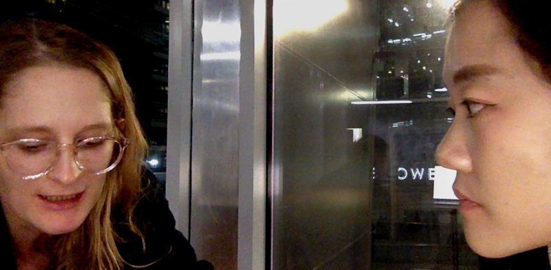
![]() Hi there! I’m Wai, a User Experience Designer, slash Art Director, slash hybrid designer.
Hi there! I’m Wai, a User Experience Designer, slash Art Director, slash hybrid designer.
My background is in advertising design and I’ve been worked as a creative art director for 7 years in creative agencies, big or small.
 Hi there! I’m Wai, a User Experience Designer, slash Art Director, slash hybrid designer.
 My background is in advertising design and I’ve been worked as a creative art director for 7 years in creative agencies, big or small.
My UX value
I am a strong believer of “You would know until you did it”.
Creativity is never a one step achievement, but result of uncountable researches plus trial and error.
I love the culture in user experience design: embrace failures. The more the failures you encountered the closer you approach success.
In this ever-evolving age, the fact is no one could have experience on things which is not exsit yet or experience of all kinds. The only solution is sharpening your ability to learn. Learn and test is the primary UX value I uphold.
T-shape UX designer
With solid experience in the field of advertising creative, I am strong in both conceptual ideas and high-level artwork execution. Track record in organizing visual projects throughout the creative process from ideation, client presentation, and implement. Yet, specializing in visual design doesn’t mean my skill is limited in visualization.
With constant training in advertising agency, I am able to approach problems with creative, aesthetic, usability design and marketing perspectives at once, with strong empathy to balance needs of stakeholder.
I have also developed the advanced multi-tasking skills working in a fast pacing and ever-changing environment, a.k.a. aglie environment in life.
![]()
Multicultural experience
Been working in London for more than one year, I have proven record to demonstrate my creative ability for multicultural and cross country markets. New businesses have successfully brought in place upon my design contribution.
![]()
With solid experience in the field of advertising creative, I am strong in both conceptual ideas and high-level artwork execution. Track record in organizing visual projects throughout the creative process from ideation, client presentation, and implement. Yet, specializing in visual design doesn’t mean my skill is limited in visualization.
With constant training in advertising agency, I am able to approach problems with creative, aesthetic, usability design and marketing perspectives at once, with strong empathy to balance needs of stakeholder.
I have also developed the advanced multi-tasking skills working in a fast pacing and ever-changing environment, a.k.a. aglie environment in life.

Multicultural experience
Been working in London for more than one year, I have proven record to demonstrate my creative ability for multicultural and cross country markets. New businesses have successfully brought in place upon my design contribution.
More UX-folio of mine

4 Days UX Sprint | User Research + Game Design
(Concept ideation & Visual design layout)
(Concept ideation & Visual design layout)