M A N N I N G S | Brand Tone Revamp
A good art direction blends client’s brief in the visual, turns the logical brief into mood and tone. Customers barely explain the visual logically but describe the brand with adjectives.
This is, to me, a sublime of advertising art direction. And what I’m trying to pursue in the past whole year. It’s never an easy job in a marketing campaign involving all kinds of mathematical people see everything literally.
BACKGROUND :
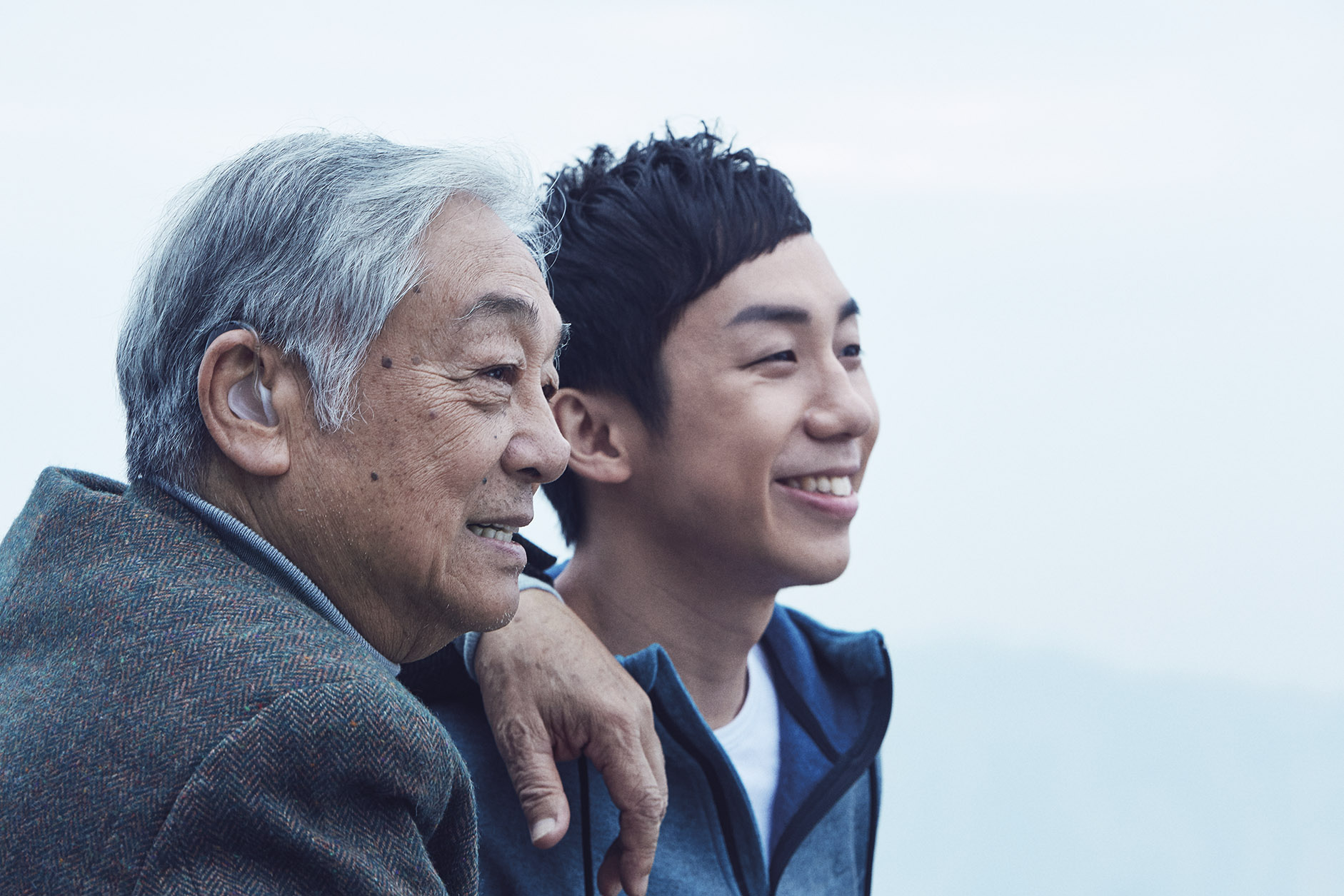
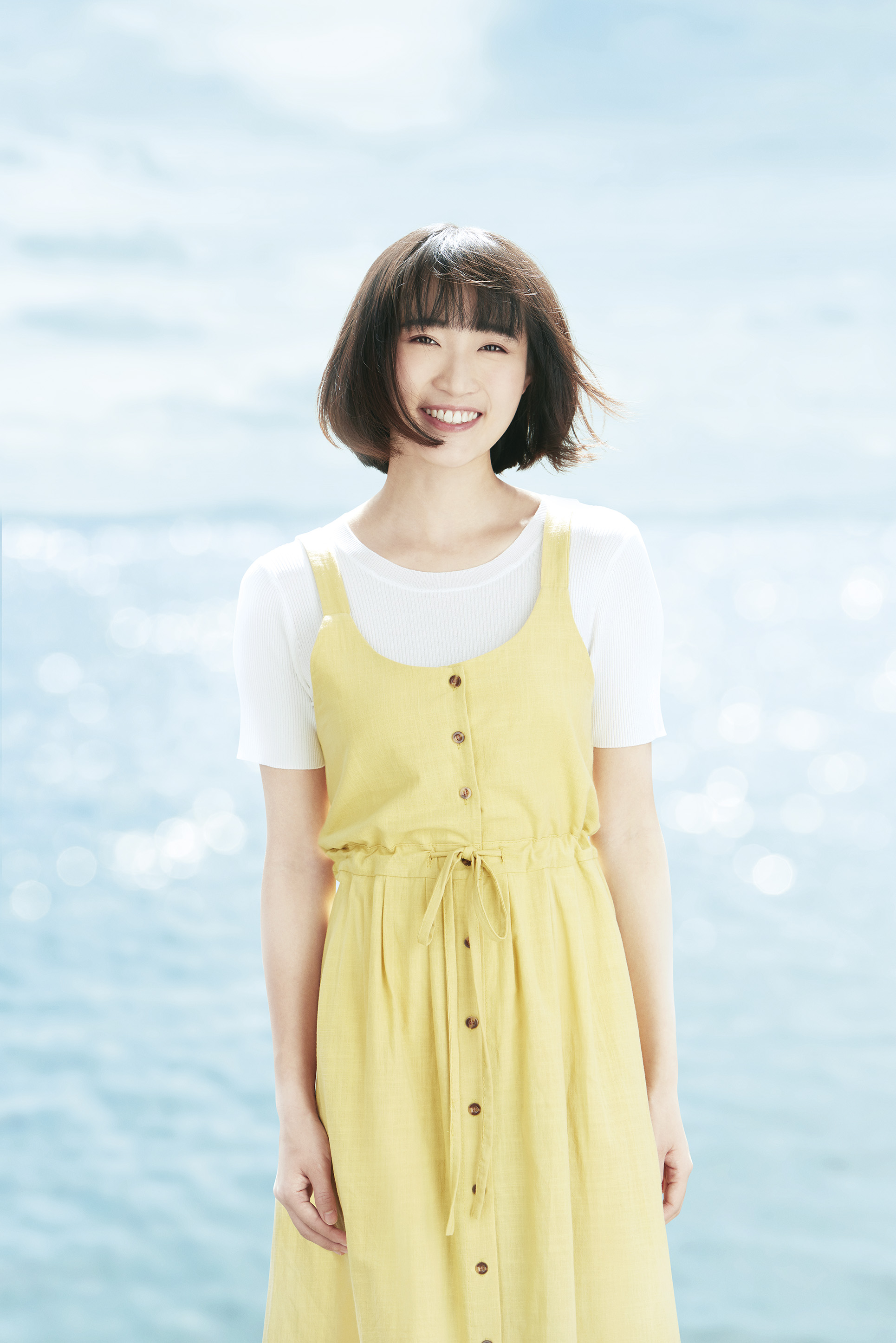
Mannings is the leading health and beauty chains in Hong Kong. It is similar to Boosts in the United Kingdom, not only sell all kinds of personal H&B products from head to toe, also offer professional clinical advisor services including prescriptions service; on-site pharmacists; dietitian; health & beauty advisors…etc.. Which are very comprehensive and strong to claim as a leading H&B store in town.

AIM:
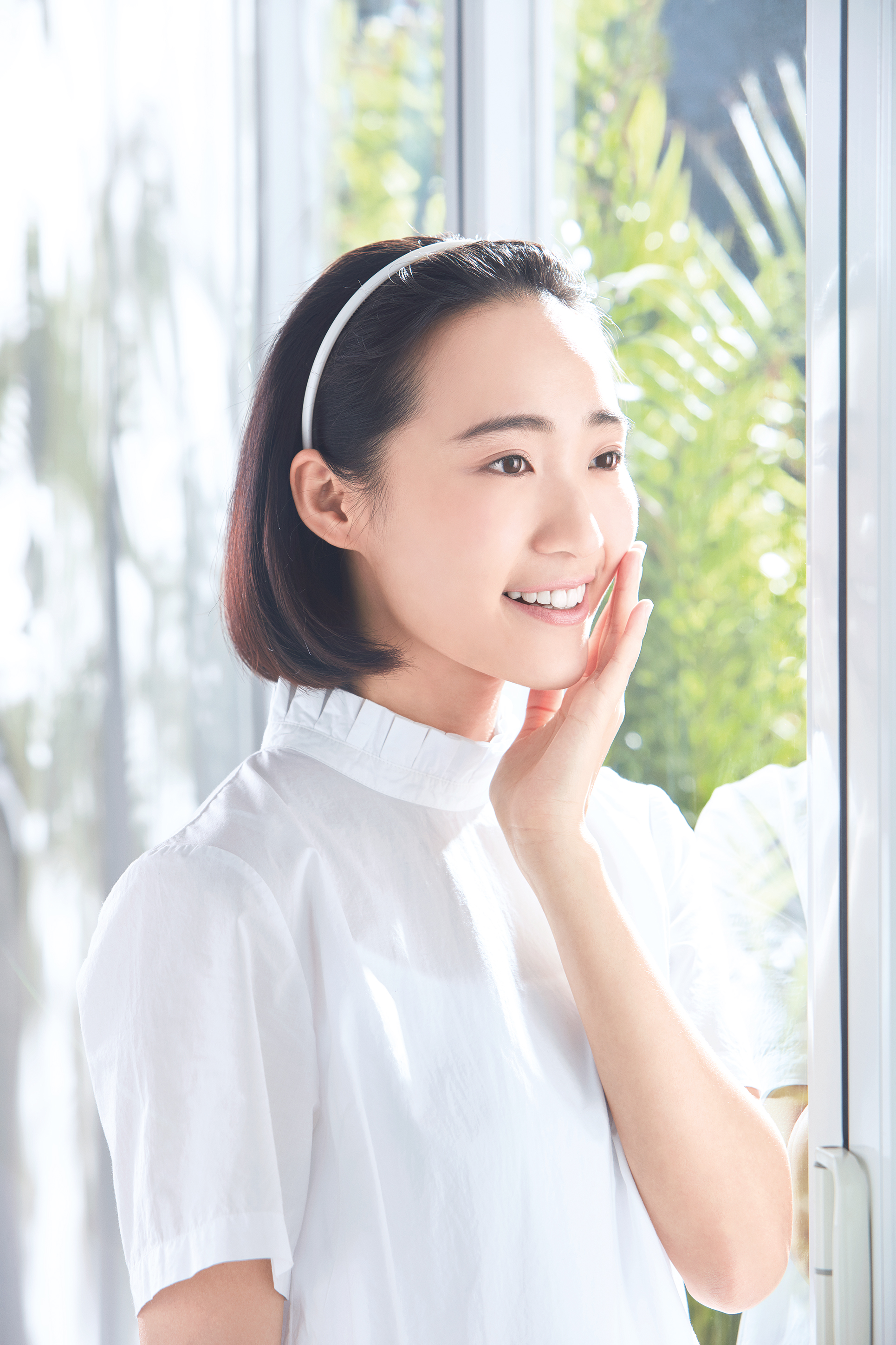
A healthy image carries the sense of refreshing aura. Reskinning brand visuals could be a tactic to make the brand looked fresh and young. So we did.

OBJECTIVES:
Objective is simple but not being simplified. Turns over 30 different categories of health & beauty service into over 20 key visuals. Thus customers could easily sense the healthy spirits via their sight.


CHALLENGE TO ART DIRECTOR:
- Reskin not rebrand. Improve the appearance yet remain the spirits of the brand image.
- This could be purely the job of art director, means lack of assistance from copywriting.
- To avoid visual duplicity while the to-be-explained services could be very similar and uneasy to tell, so does the budget control.
__________________________________________________________________
CREDITS:
Senior Art Director - Chris Leung
Art Director - Wai Wai Wai
Photographer: Jacky Chee
A project as from mid-2017 to 2018 onwards.